Zeta Charter Schools
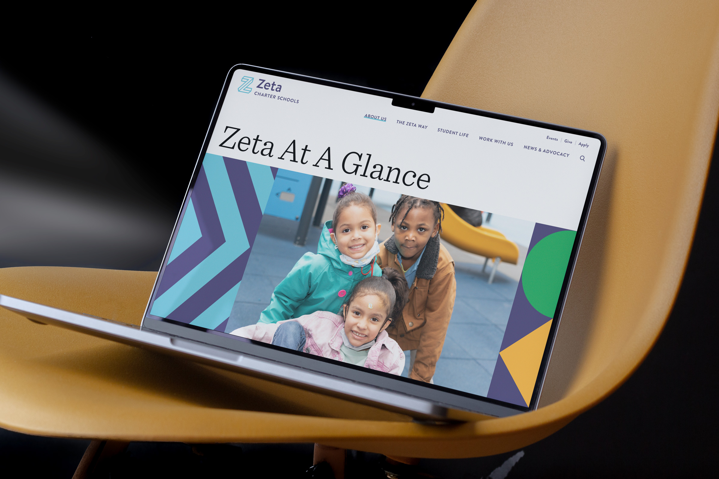
Zeta Schools are charter schools across New York City focusing on a service-driven whole-child approach to schooling. To celebrate the opening of their new campus, we helped the Zeta team refresh their website, bringing the brand energy from the new campus into the website. Design in Collaboration with Apartment One
Role: Visual and interaction design
Website: zetaschools.org
Role: Visual and interaction design
Website: zetaschools.org

Website Strategy
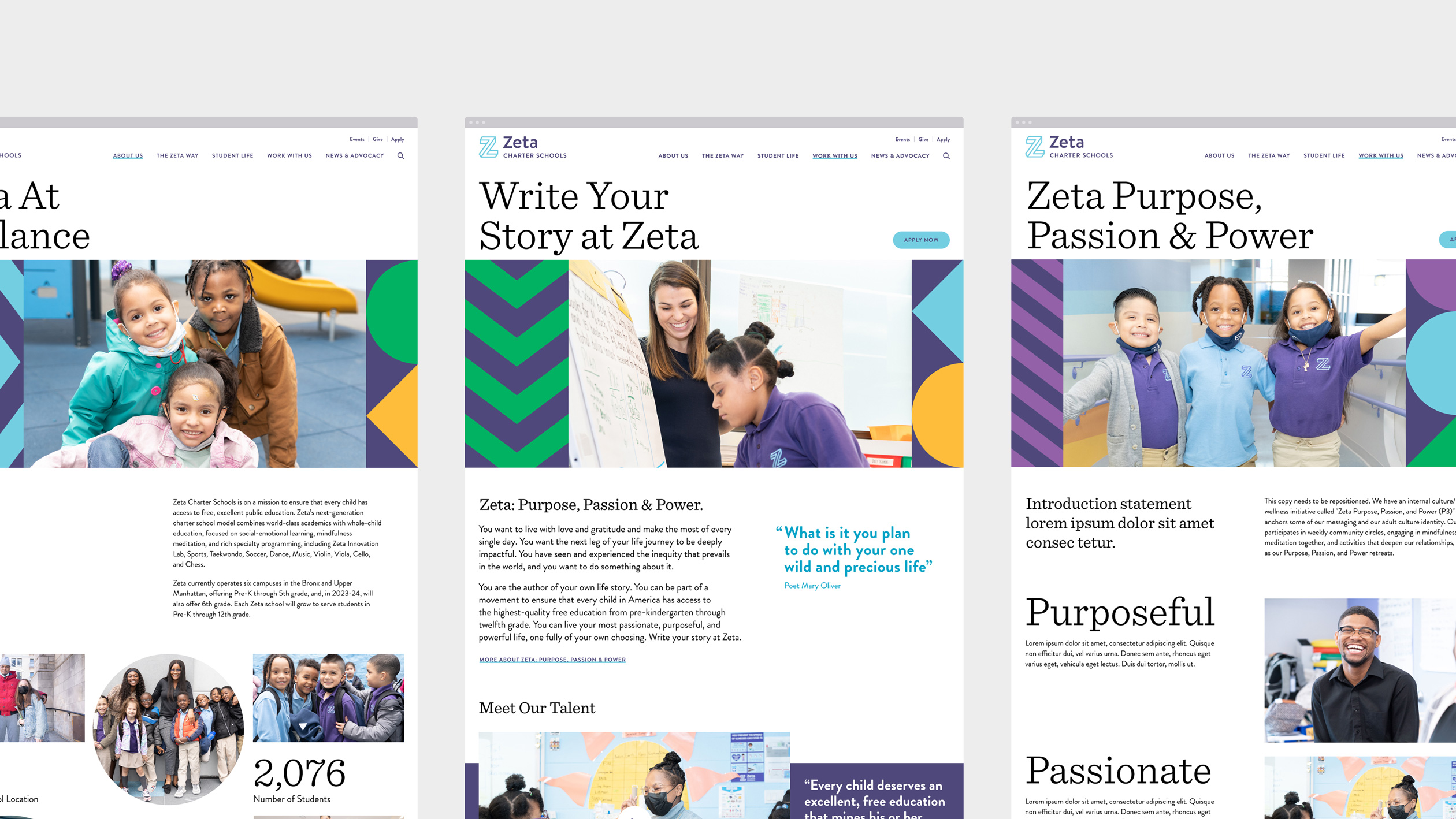
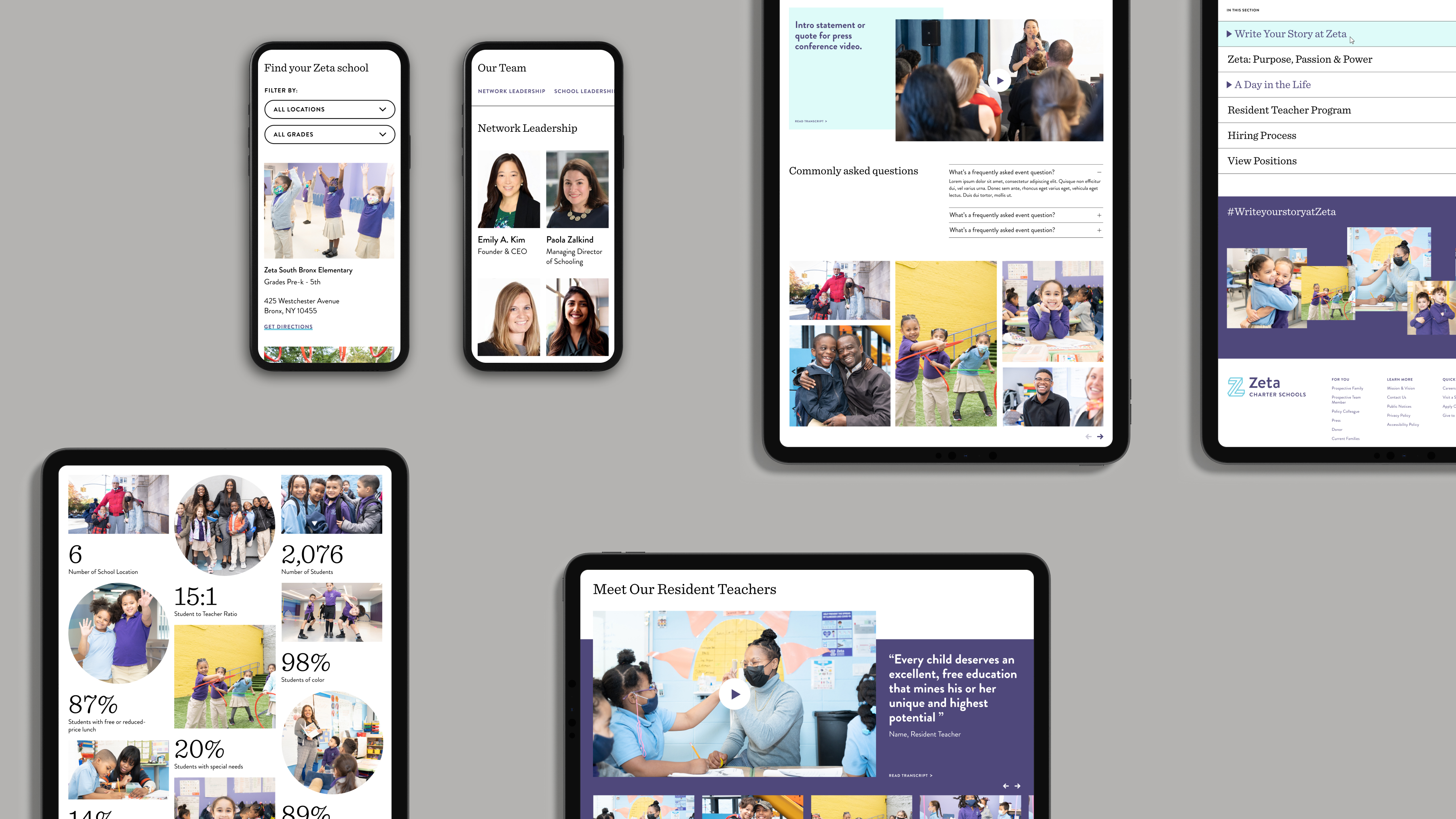
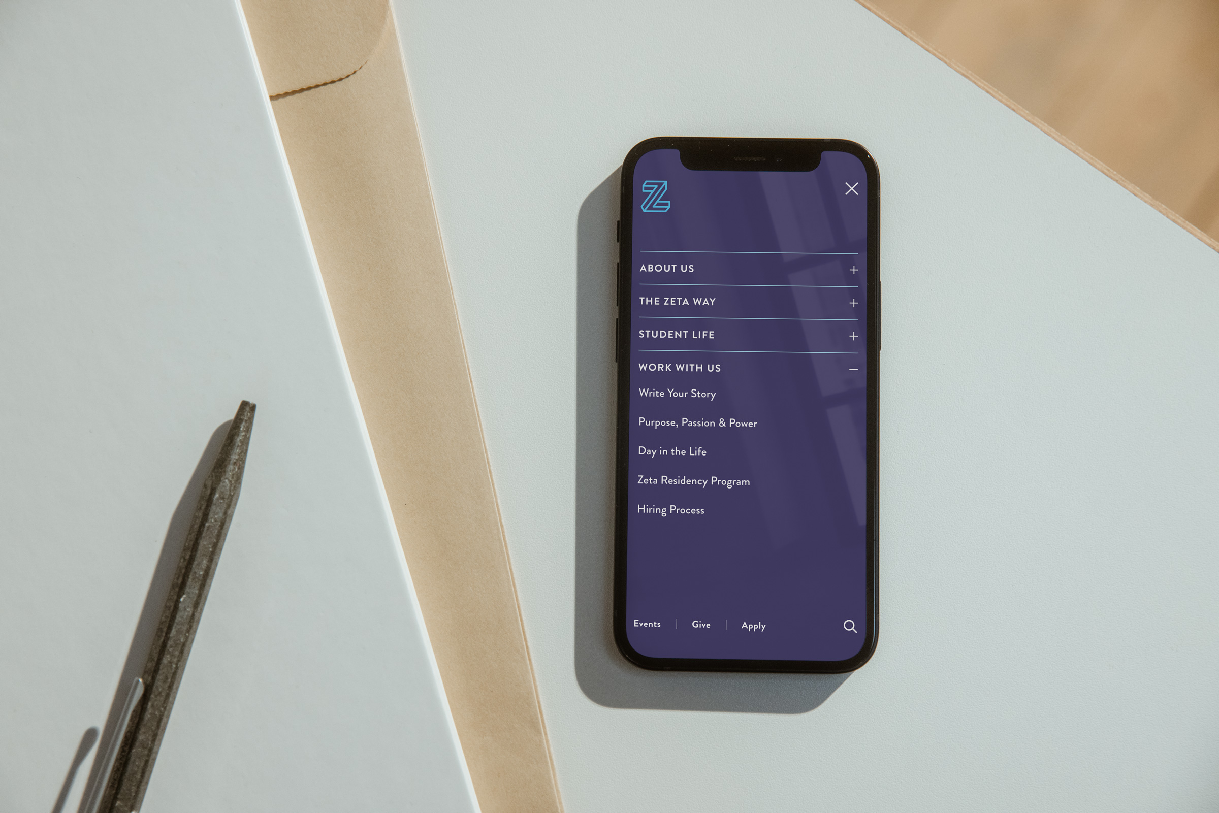
Our collaboration with the Zeta team led to the development of a new content strategy that aligns with their new messaging, emphasizing specific aspects of the school's mission or values. This strategy facilitated the creation of a user-friendly navigation system akin to chapters at the end of each page. We also revamped the content hierarchy, giving prominence to the voices of students and faculty and enhancing the overall user experience.
Our collaboration with the Zeta team led to the development of a new content strategy that aligns with their new messaging, emphasizing specific aspects of the school's mission or values. This strategy facilitated the creation of a user-friendly navigation system akin to chapters at the end of each page. We also revamped the content hierarchy, giving prominence to the voices of students and faculty and enhancing the overall user experience.


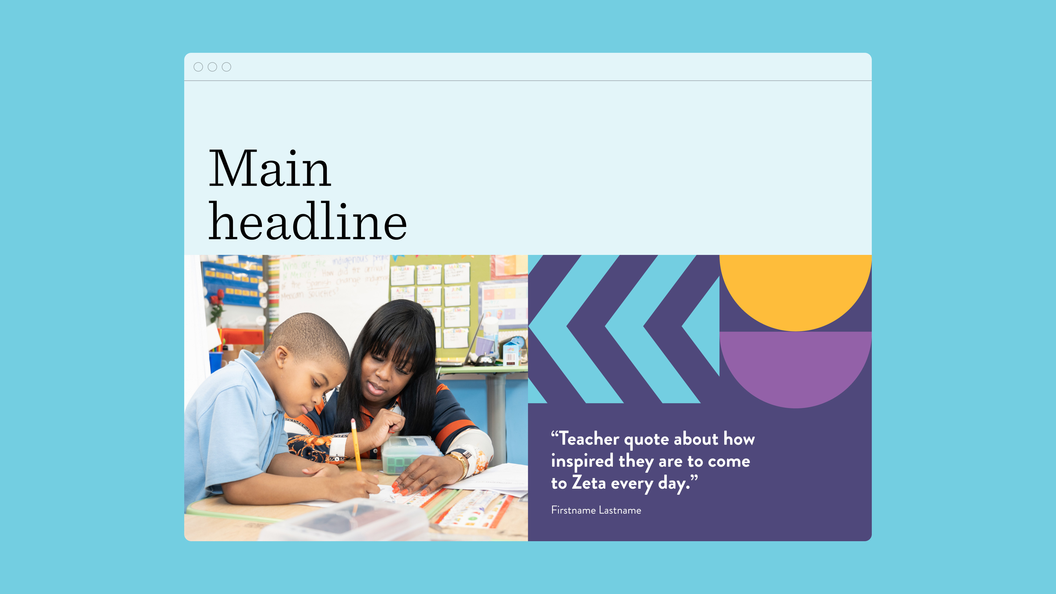
Dynamic modules
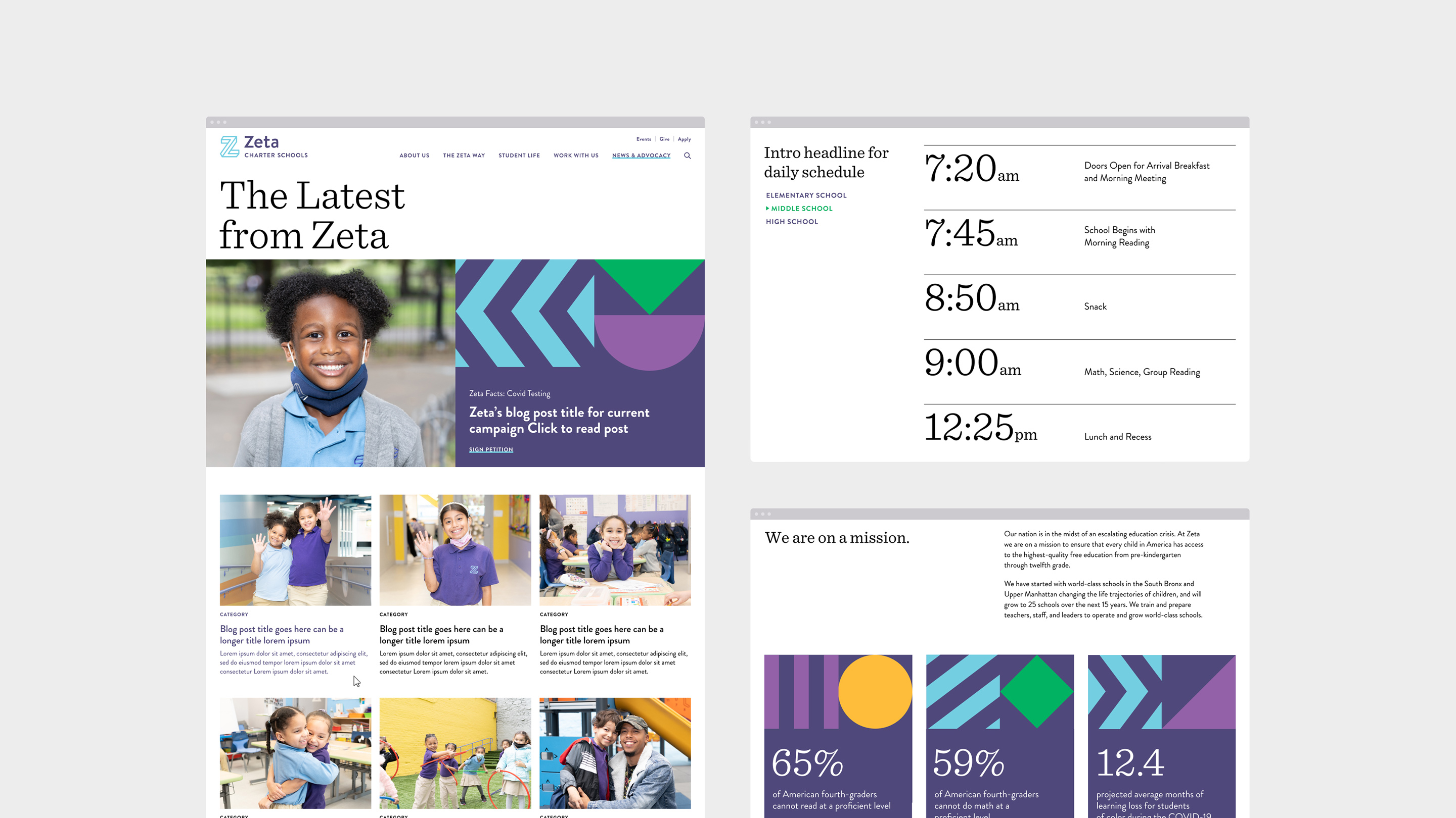
Part of the website redesign was to bring new energy into the hero module at the top of each page. We made these modules dynamic so they could fit different types of content alongside graphic elements and photography that focus on the daily lives of students and faculty.
Part of the website redesign was to bring new energy into the hero module at the top of each page. We made these modules dynamic so they could fit different types of content alongside graphic elements and photography that focus on the daily lives of students and faculty.



Brand Refresh
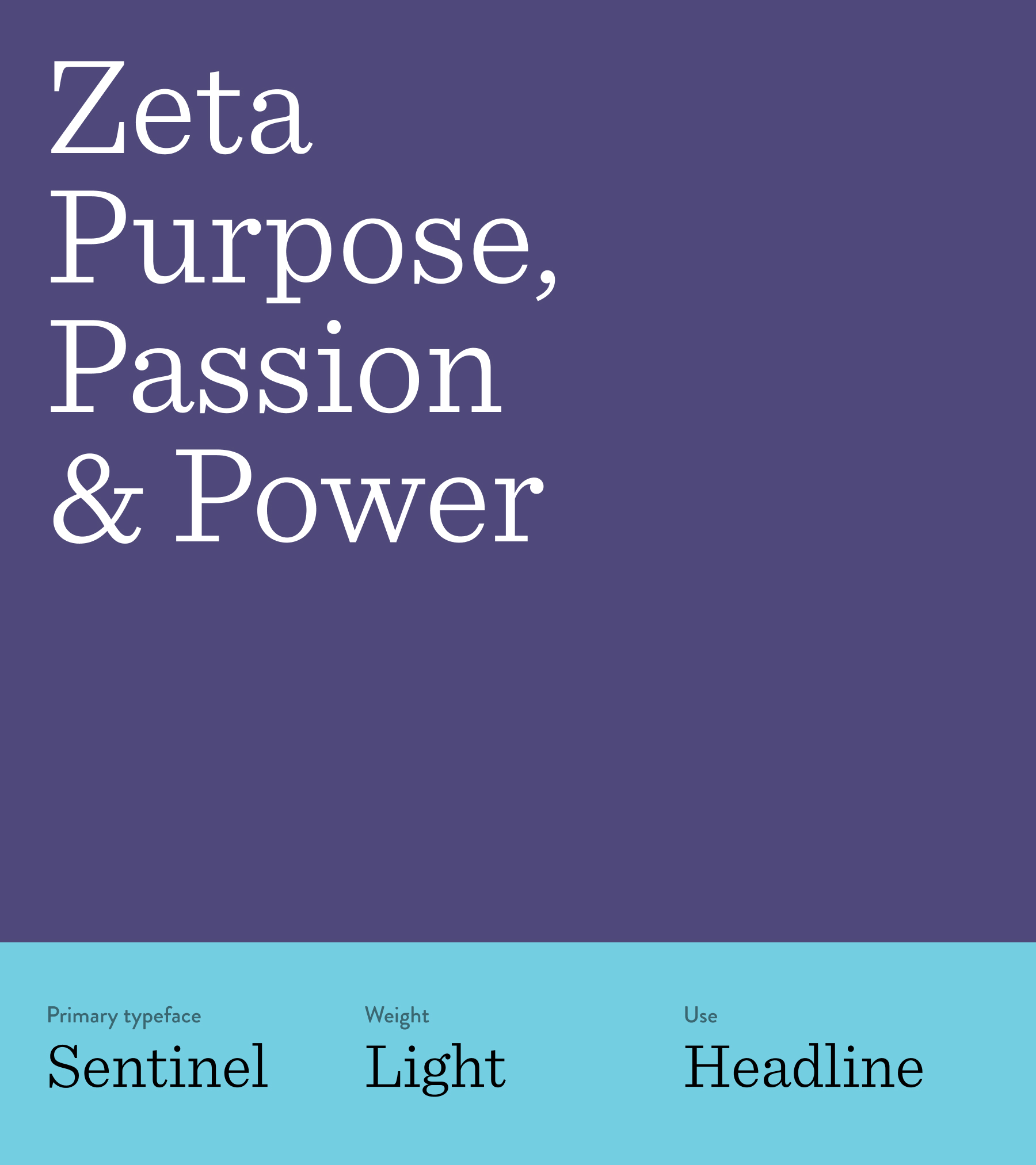
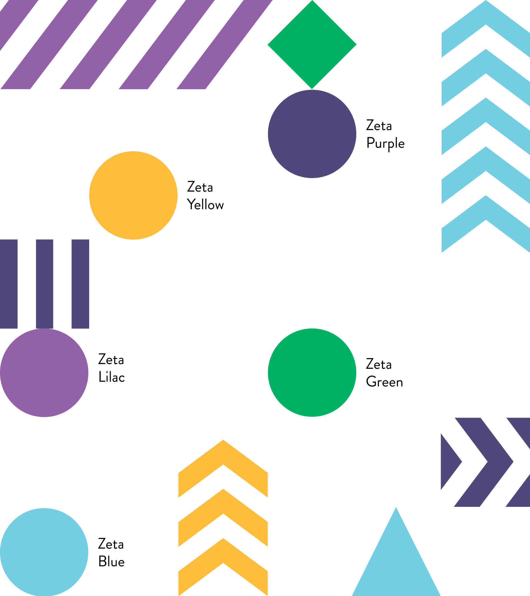
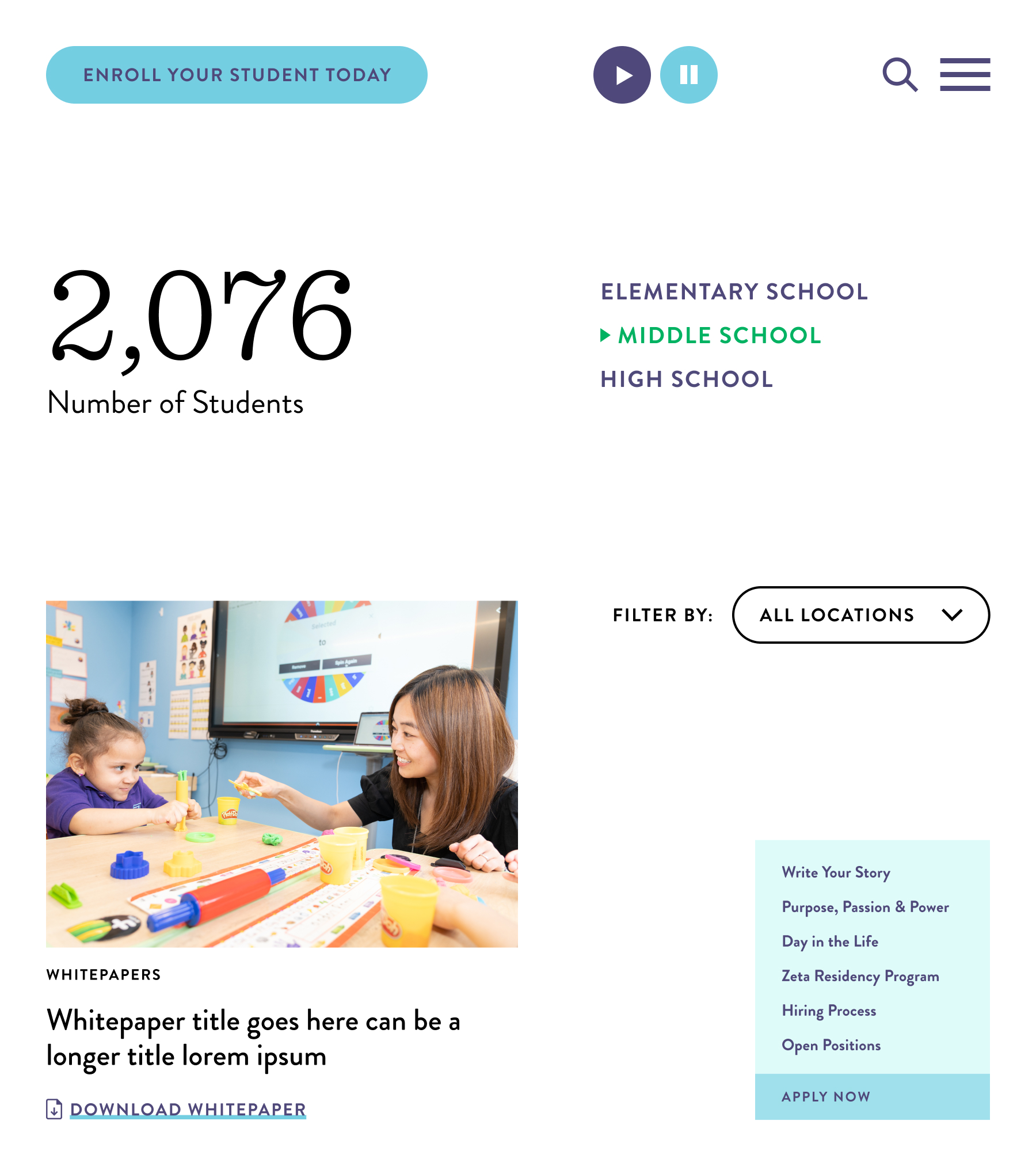
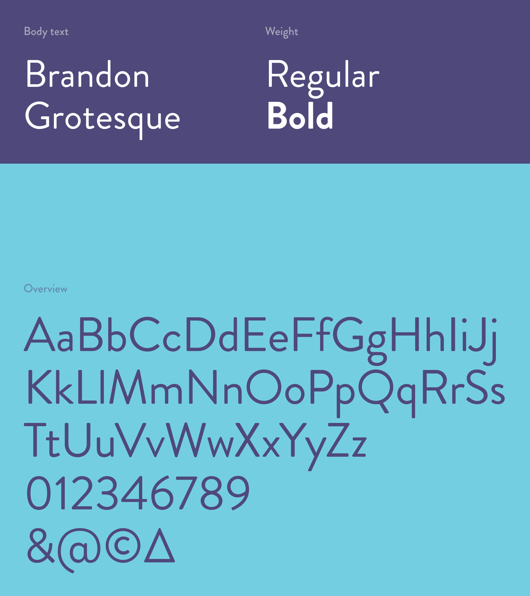
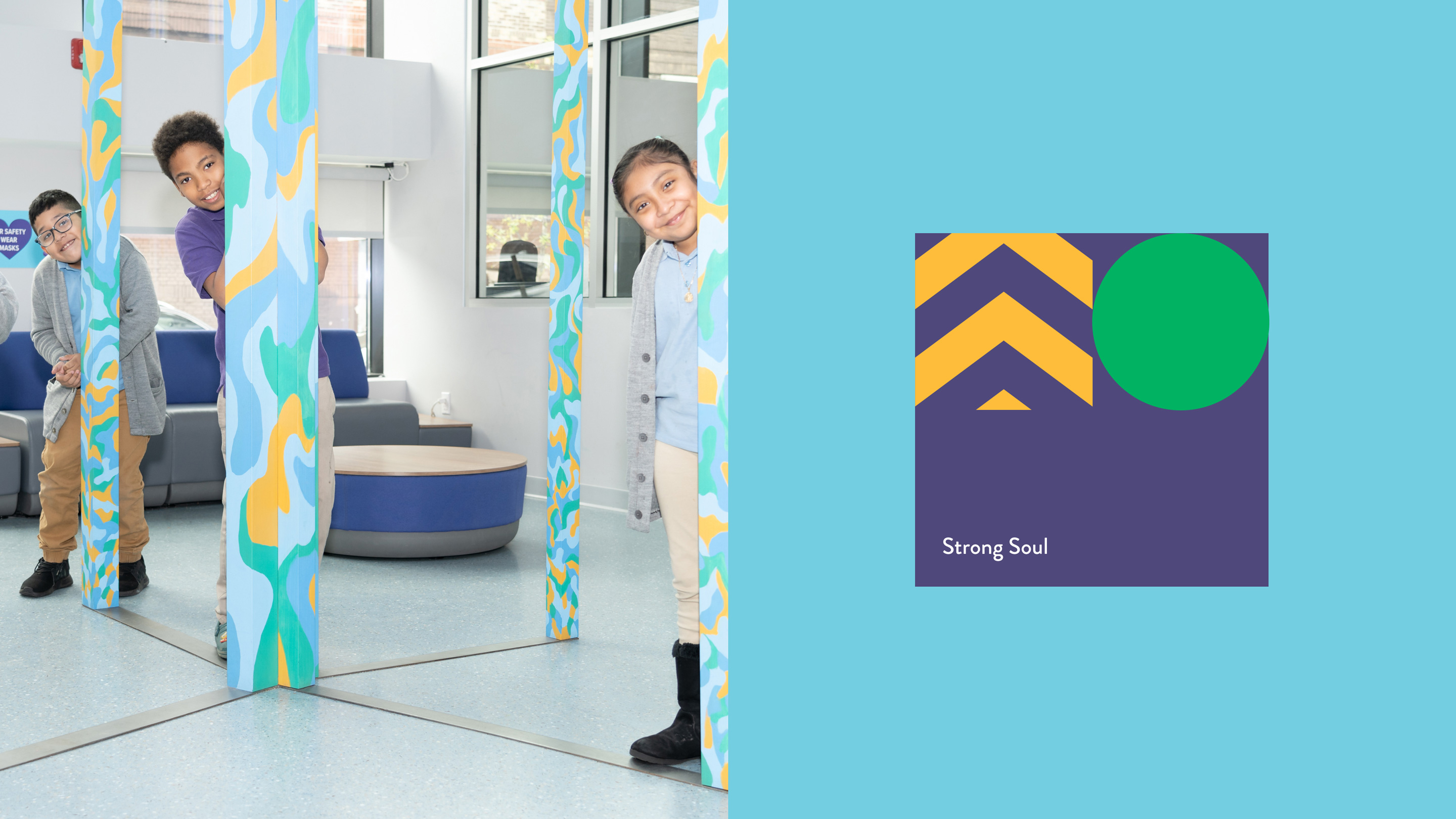
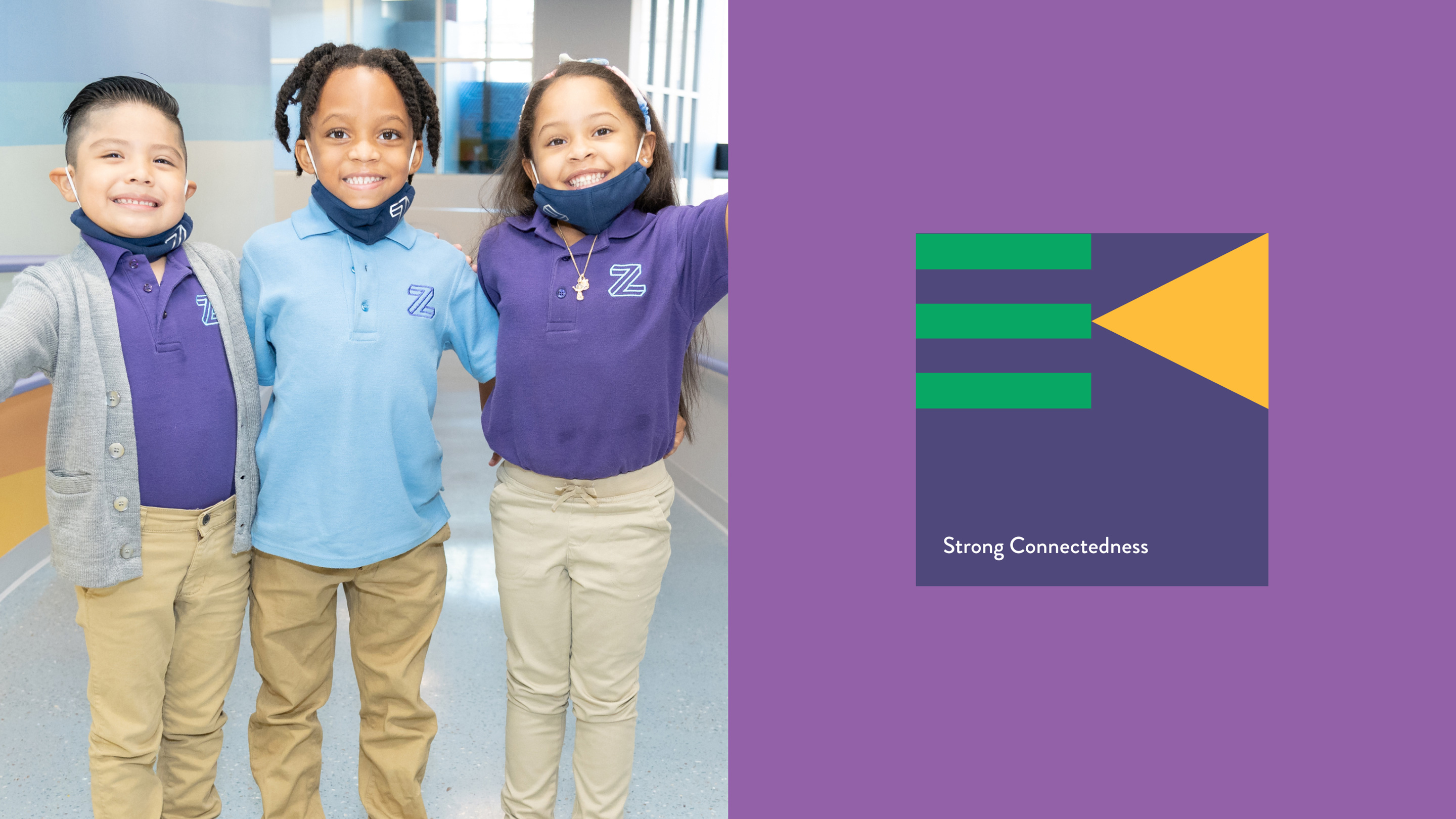
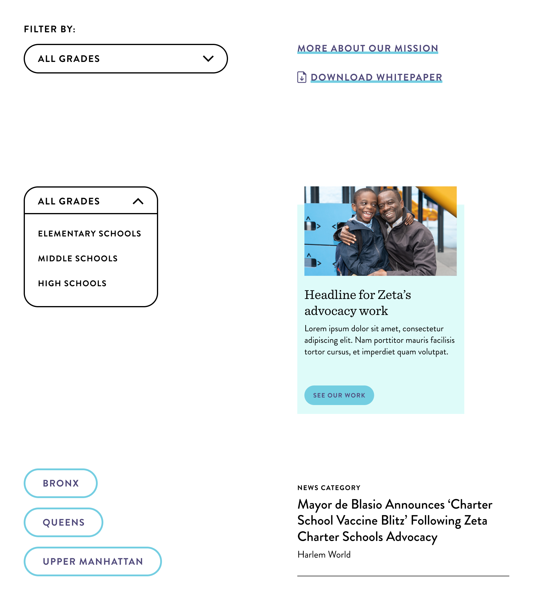
The brand refresh we deployed across the new website combines a touch of academia with childlike energy. Thanks to its slab-serif nature, we chose Sentinel as our headline text for its educational feel. On the other hand, Brandon Grotesque adds a touch of boldness and modernity to the design. Combining geometric graphic elements with a vibrant color system injects childlike energy and boldness into the website.
The brand refresh we deployed across the new website combines a touch of academia with childlike energy. Thanks to its slab-serif nature, we chose Sentinel as our headline text for its educational feel. On the other hand, Brandon Grotesque adds a touch of boldness and modernity to the design. Combining geometric graphic elements with a vibrant color system injects childlike energy and boldness into the website.


Bringing the digital brand into the physical world
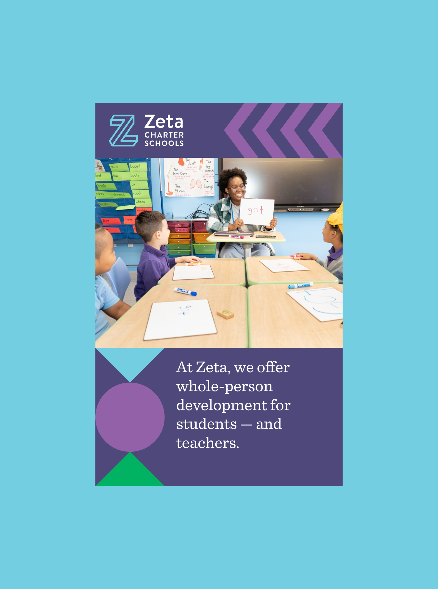
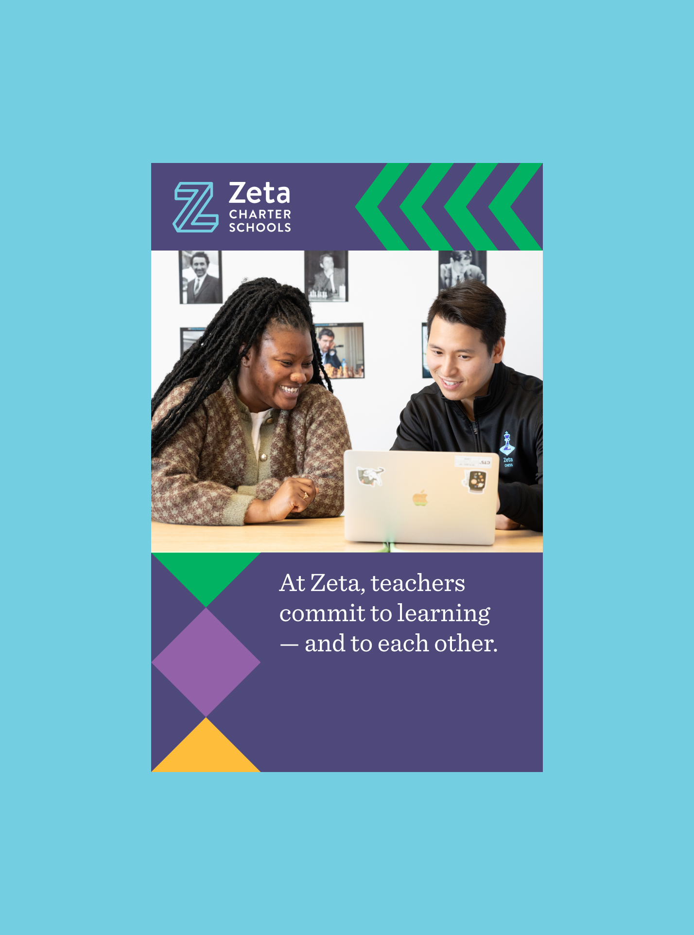
After launching the new Zeta website, we had an opportunity to bring some of the new branding into the physical world. A marketing campaign used the new brand for posters and street banners, allowing us to flex the new system.
After launching the new Zeta website, we had an opportunity to bring some of the new branding into the physical world. A marketing campaign used the new brand for posters and street banners, allowing us to flex the new system.




Project team
- Project Manager & Design Director: Liza Lowinger
- UX Strategy: Amanda Forte
- Visual & Interaction design: Jaime Patino-Calvo
Brand, Product & Experience Design • Jaime.patinocalvo@gmail.com • 954.993.9313