The New York Review of Books
The Review has been considered by many to be the “premier literary-intellectual magazine in the English language” but their digital presence was lagging. We updated the Reviews website to appeal to a new audience while staying close to their heritage. Designed at Athletics
Website: nybooks.com
Role: UX, UI, Interaction and system design
Recognition: 2021 Webby winner
Website: nybooks.com
Role: UX, UI, Interaction and system design
Recognition: 2021 Webby winner
Big picture
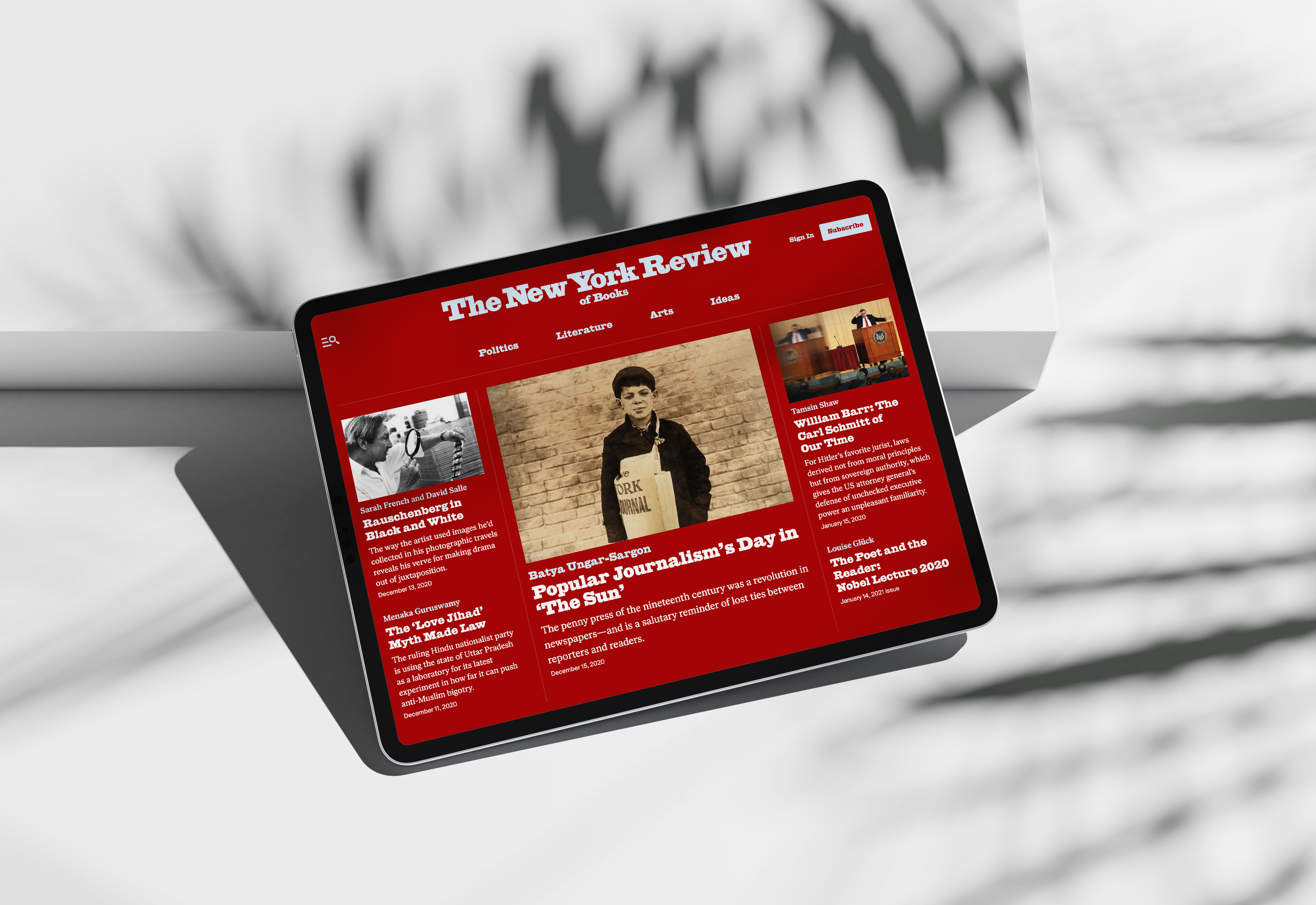
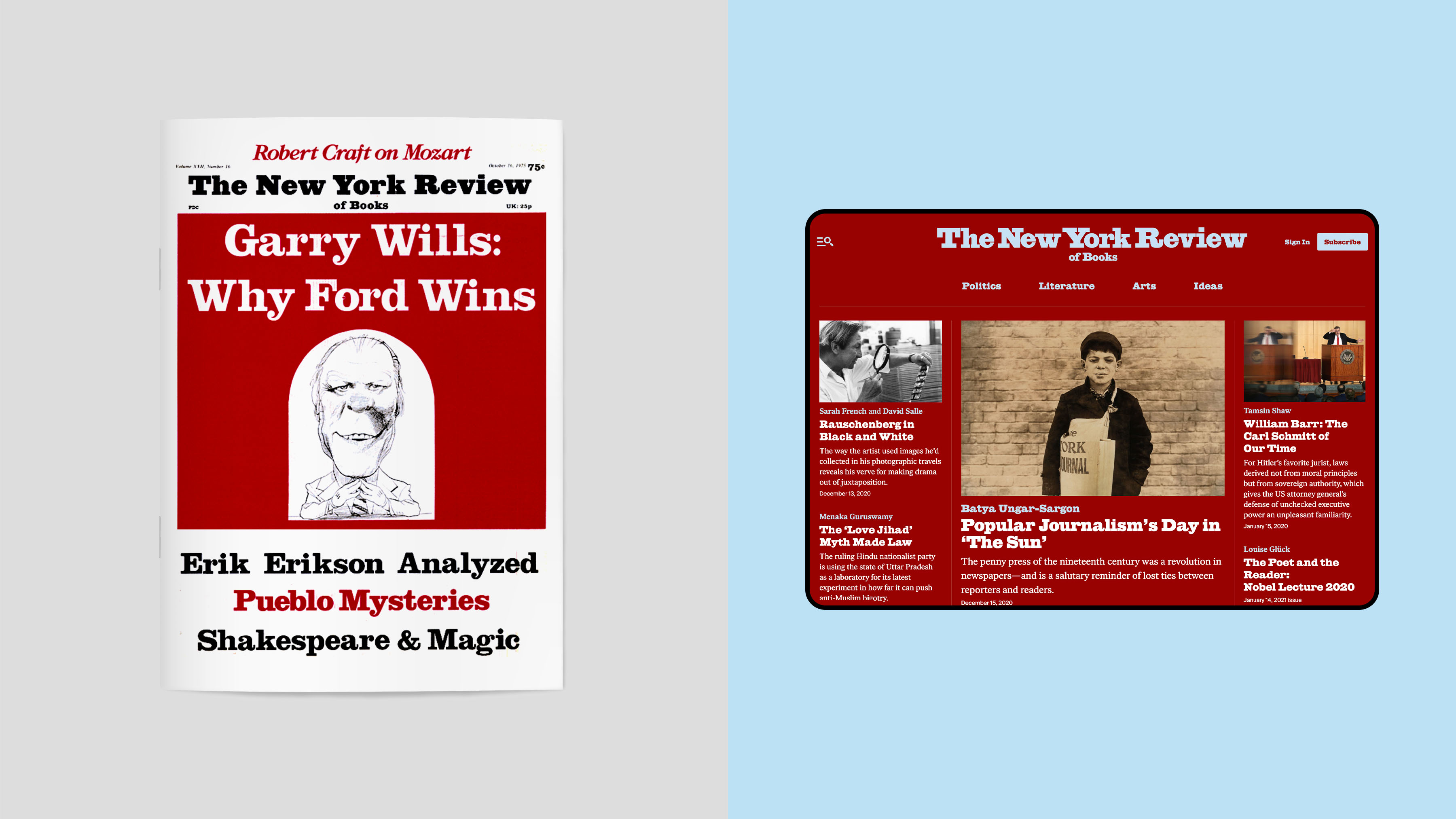
Working closely with the editors and content managers, we redesign the website experience to include a new modular approach for both the homepage and lander pages. This approach gave content managers a dynamic way to build pages and tell stories.
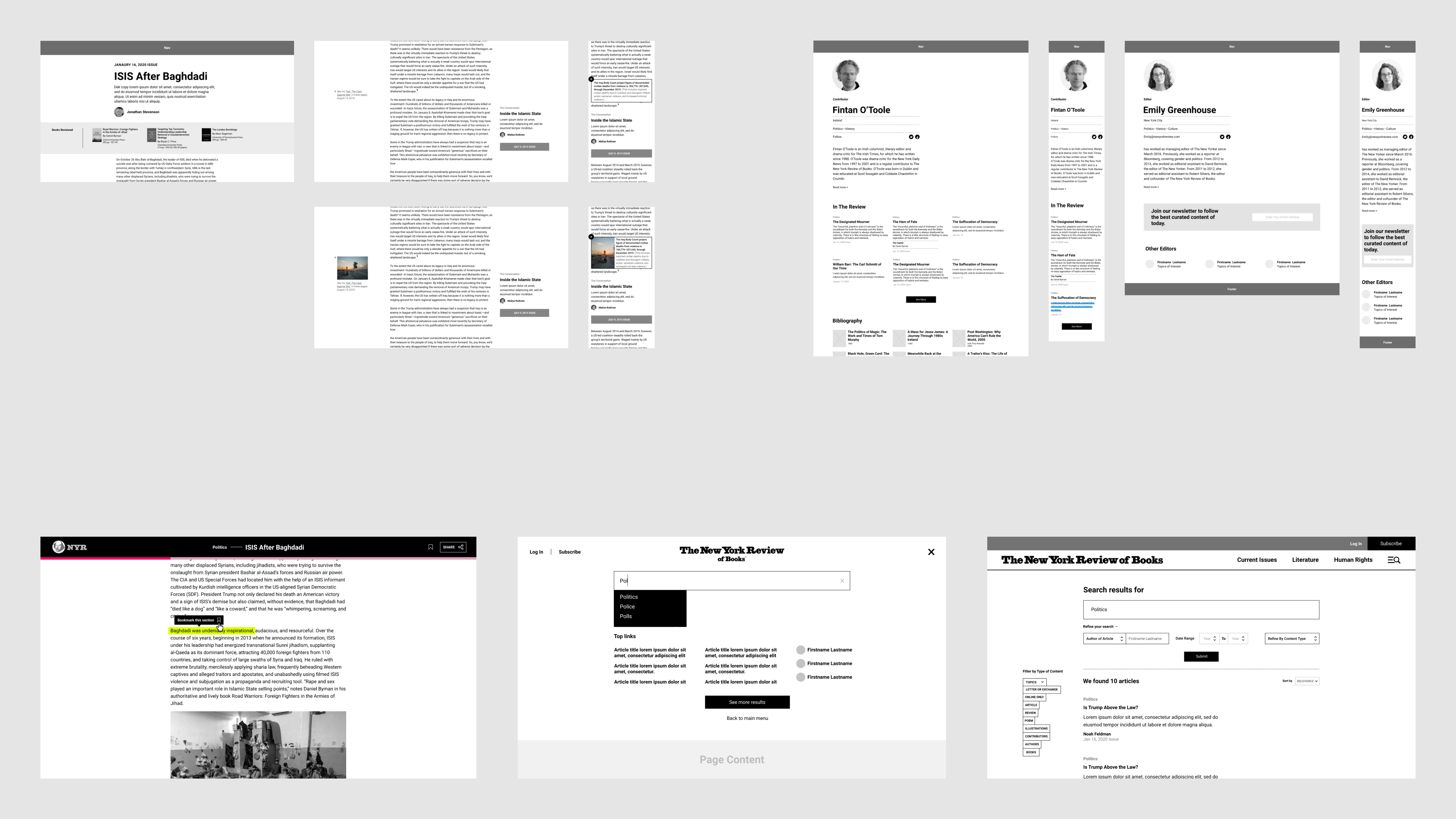
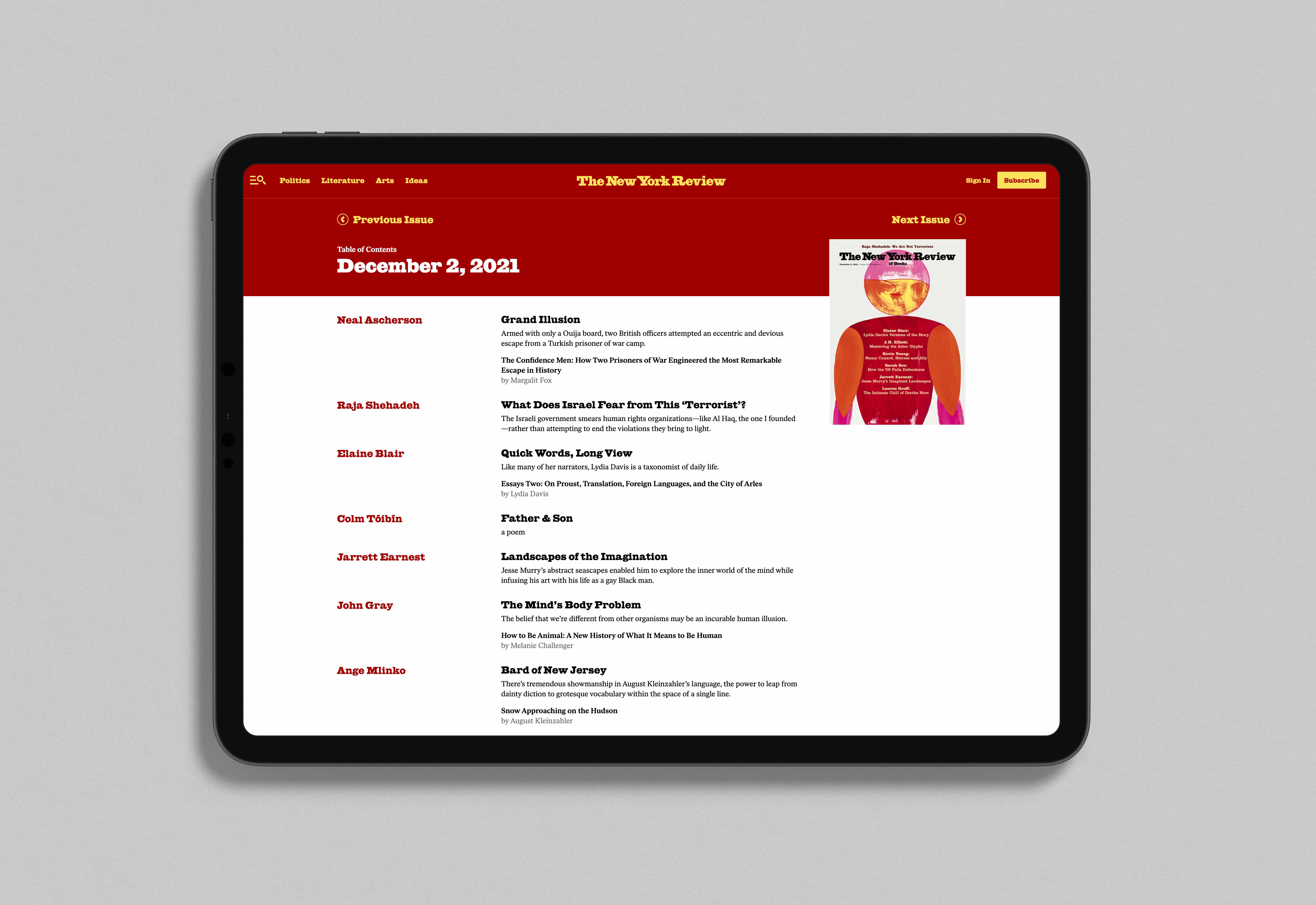
We also designed unique templates for different types of article pages. With multiple templates, editors have the freedom to highlight and elevate different stories.
Lastly, Within our digital system, we developed unique modules to surface other content like books, archive content, and quotes.
Working closely with the editors and content managers, we redesign the website experience to include a new modular approach for both the homepage and lander pages. This approach gave content managers a dynamic way to build pages and tell stories.
We also designed unique templates for different types of article pages. With multiple templates, editors have the freedom to highlight and elevate different stories.
Lastly, Within our digital system, we developed unique modules to surface other content like books, archive content, and quotes.


UX strategy
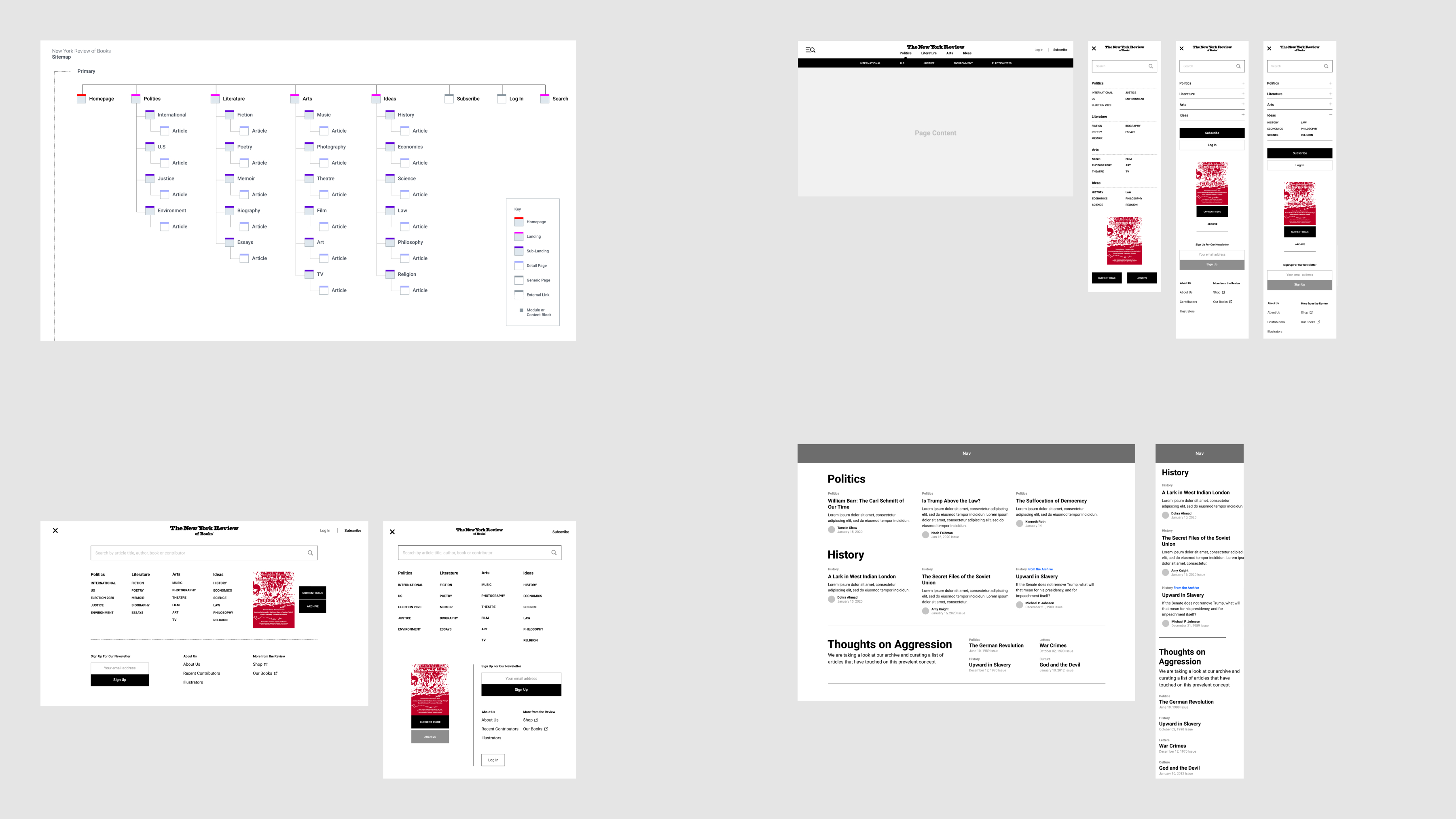
We began defining the website experience by outlining site and client goals based on stakeholder interviews. We then took those findings and ran workshops to determine taxonomy and website features.
After collecting findings from the workshops, we began defining sitemap, wireframes, and prototyping key pages and website features like navigation and archive collections.
Visual system
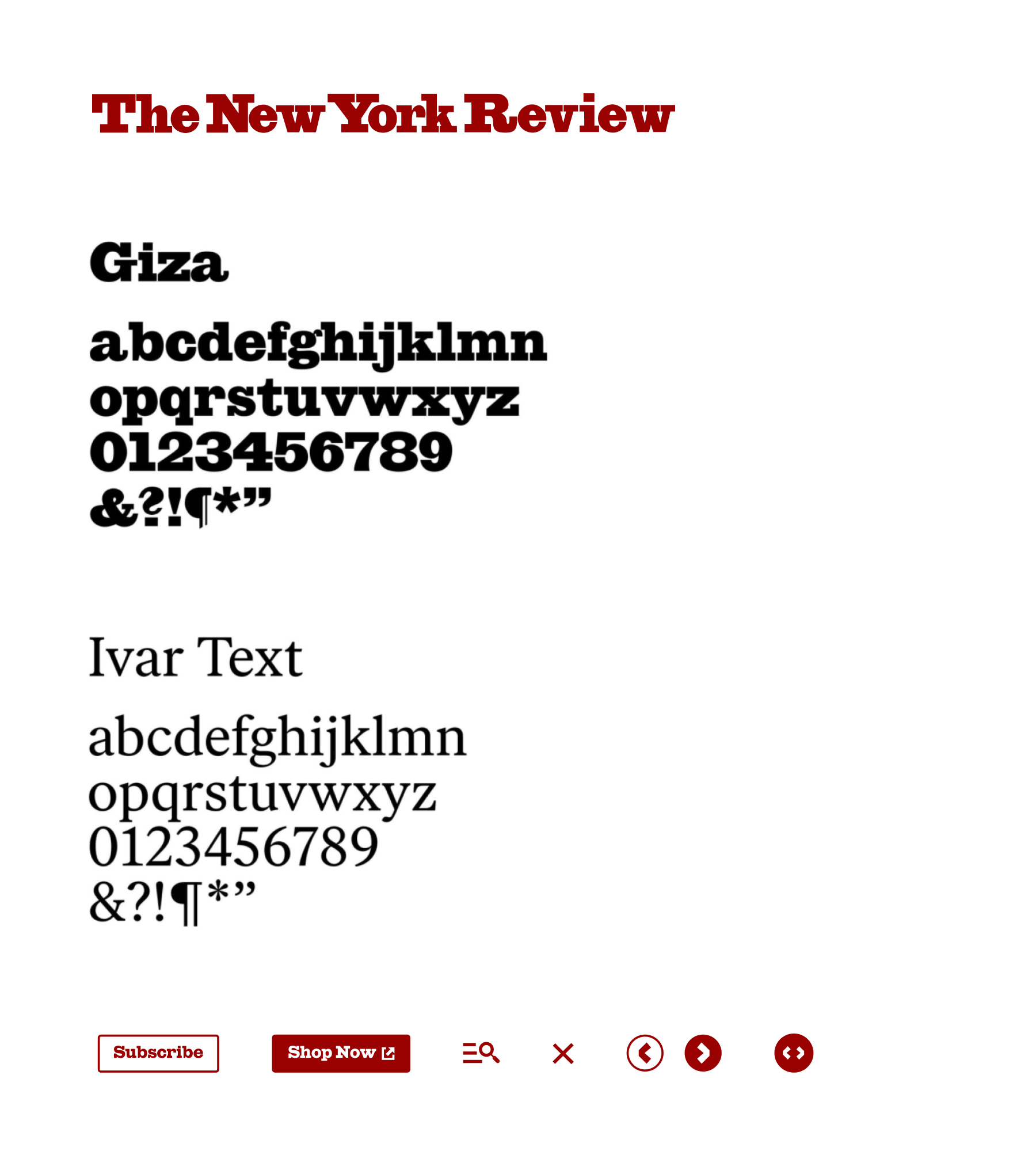
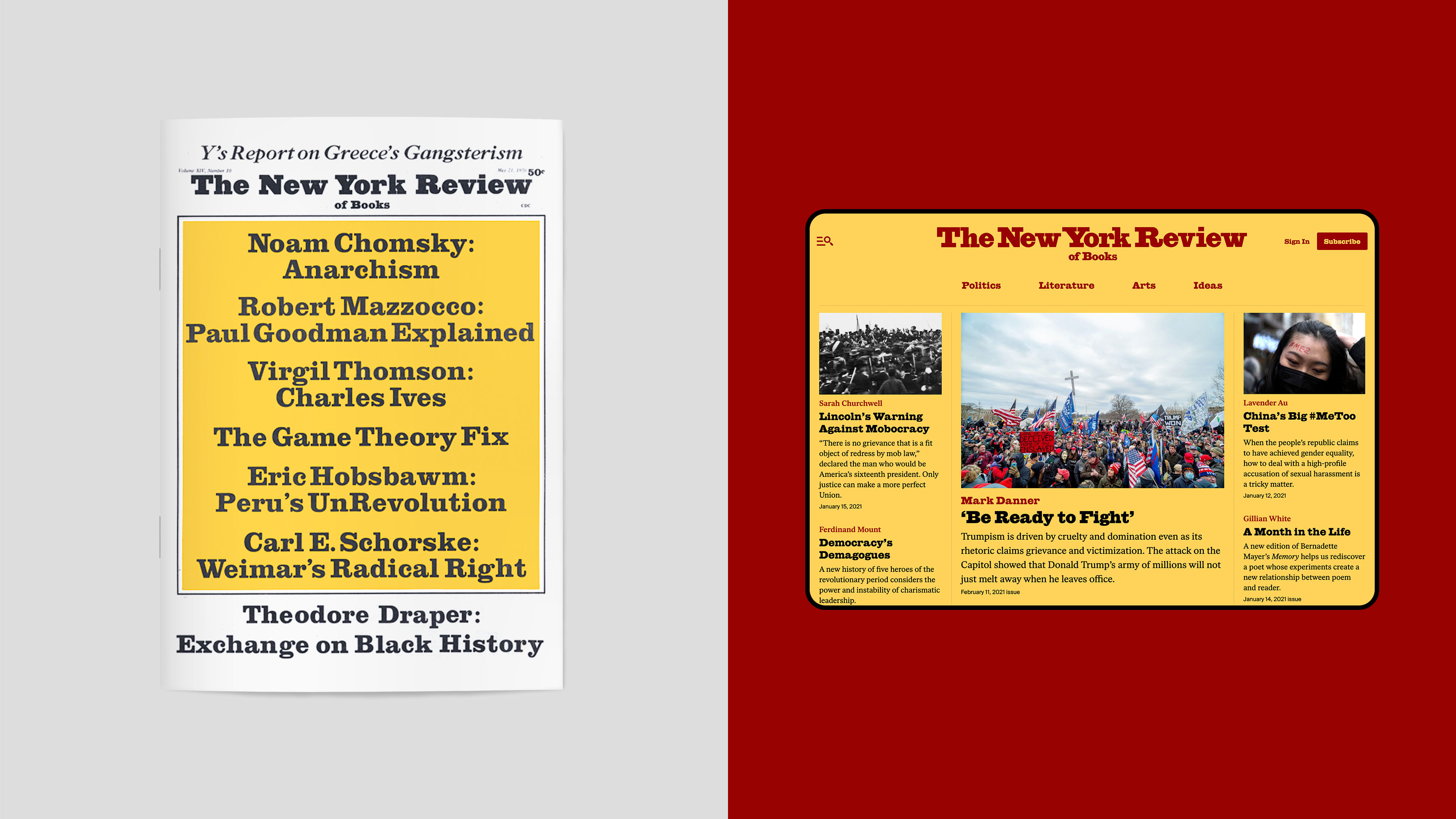
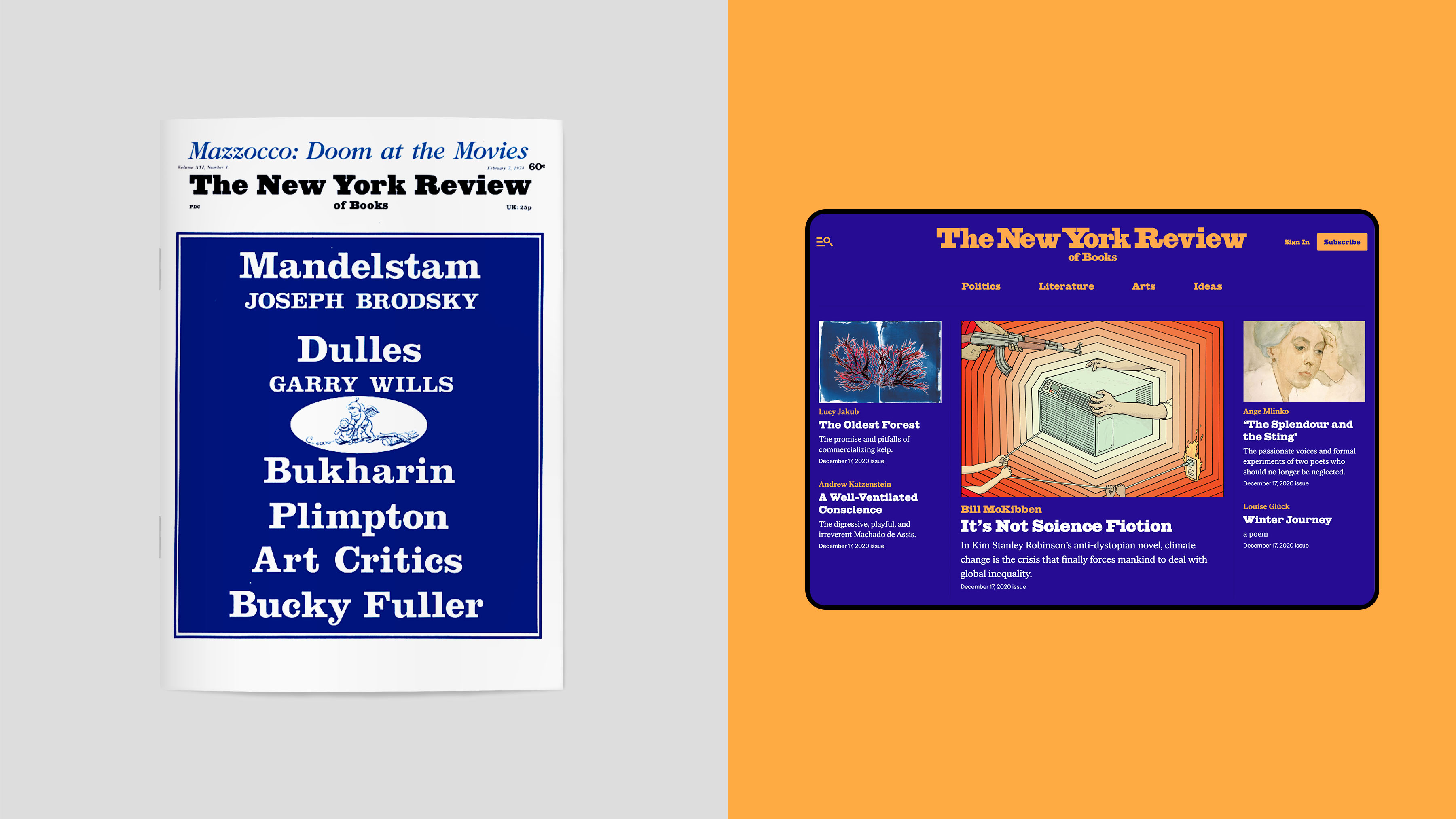
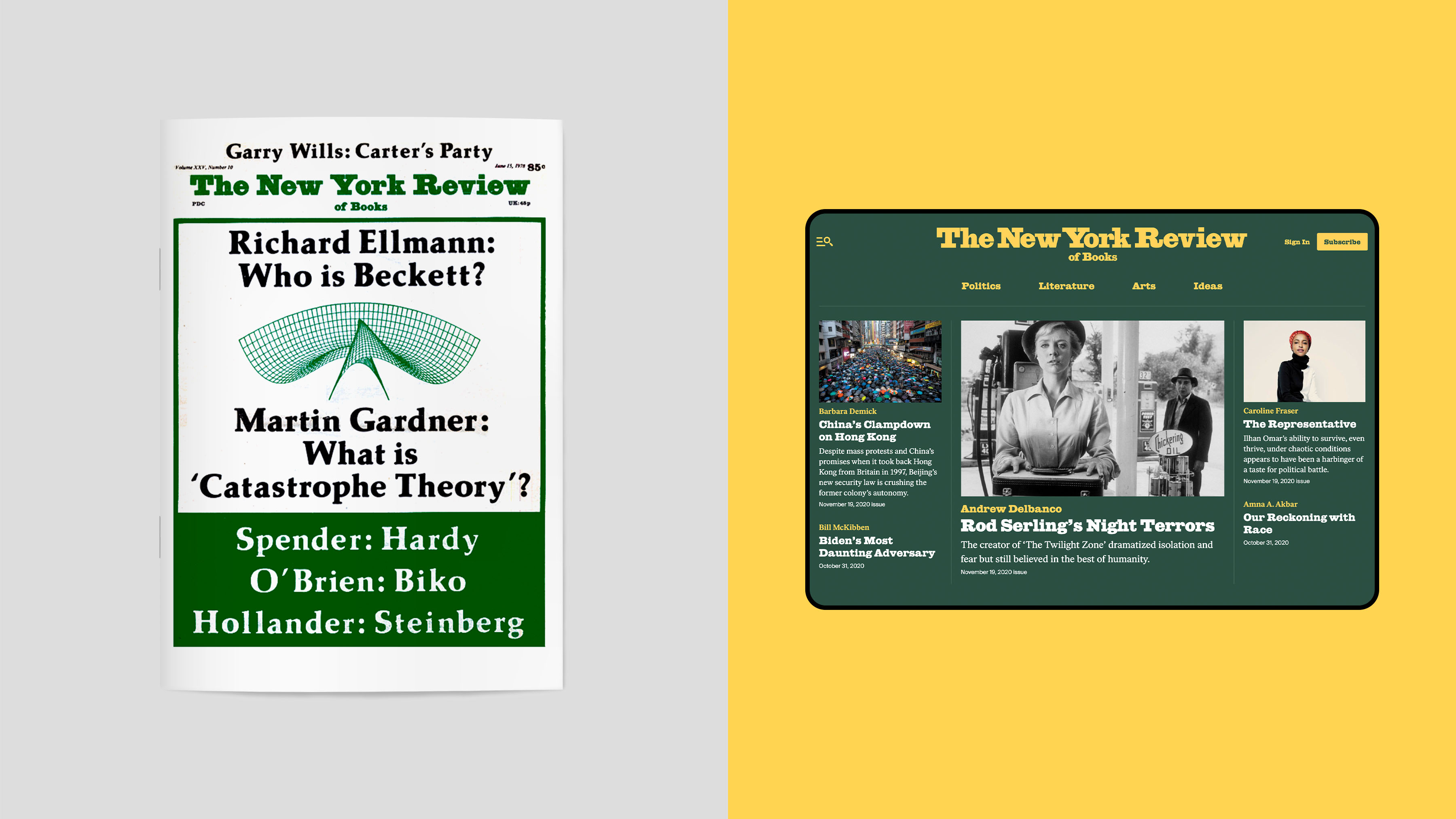
Our visual system brings the heritage of The Review to the forefront by embracing their signature font, Giza. We used it for headlines and titles. We also found a complimentary font, Ivar, for body copy.
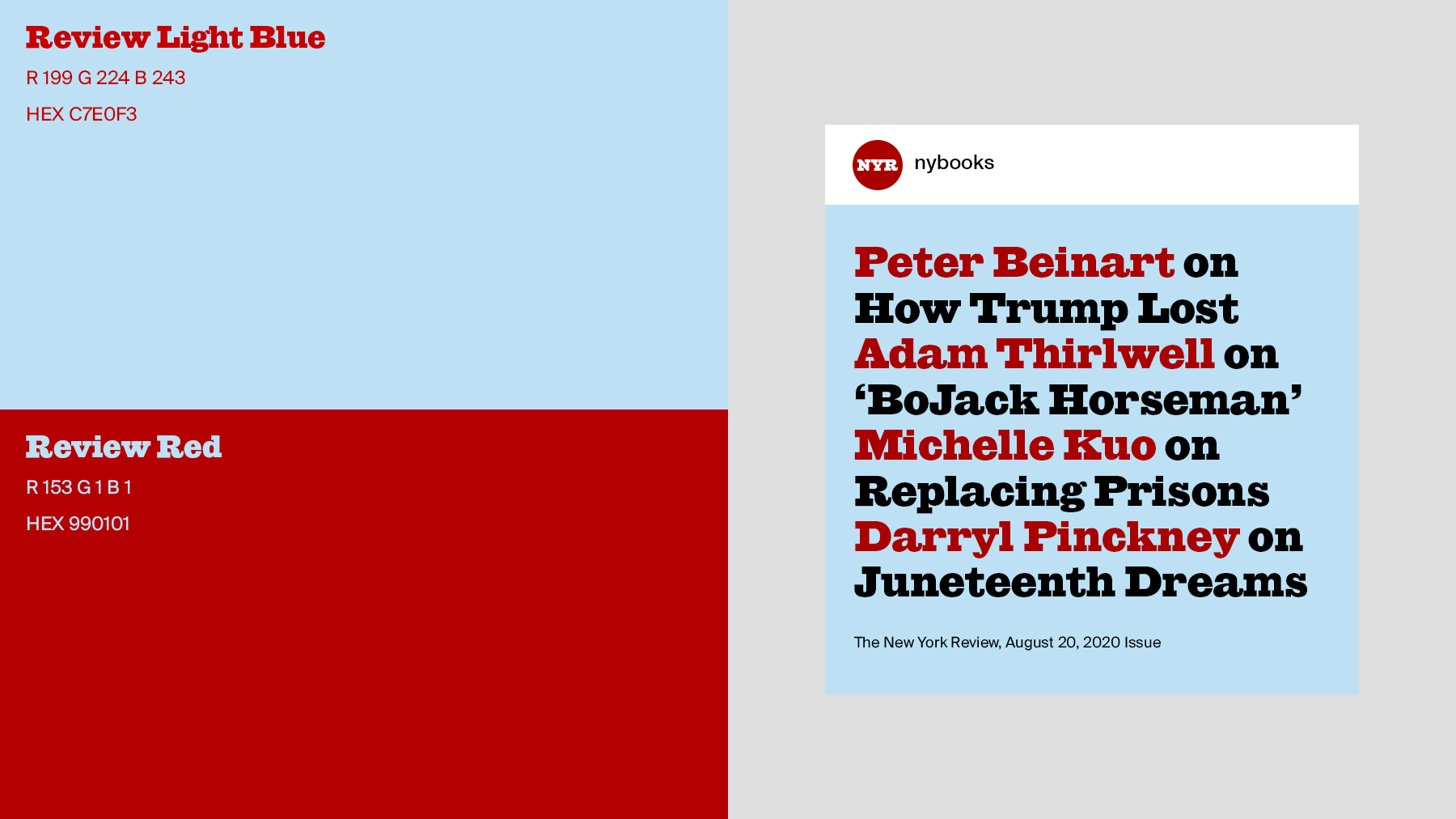
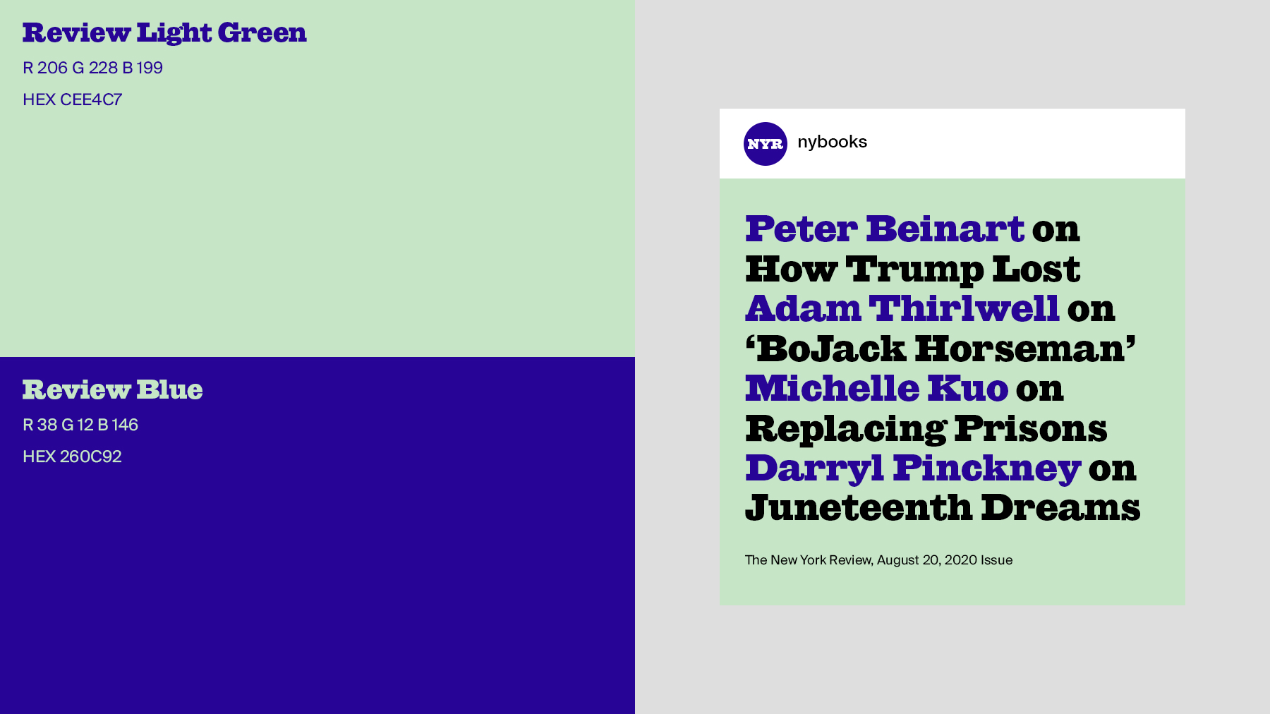
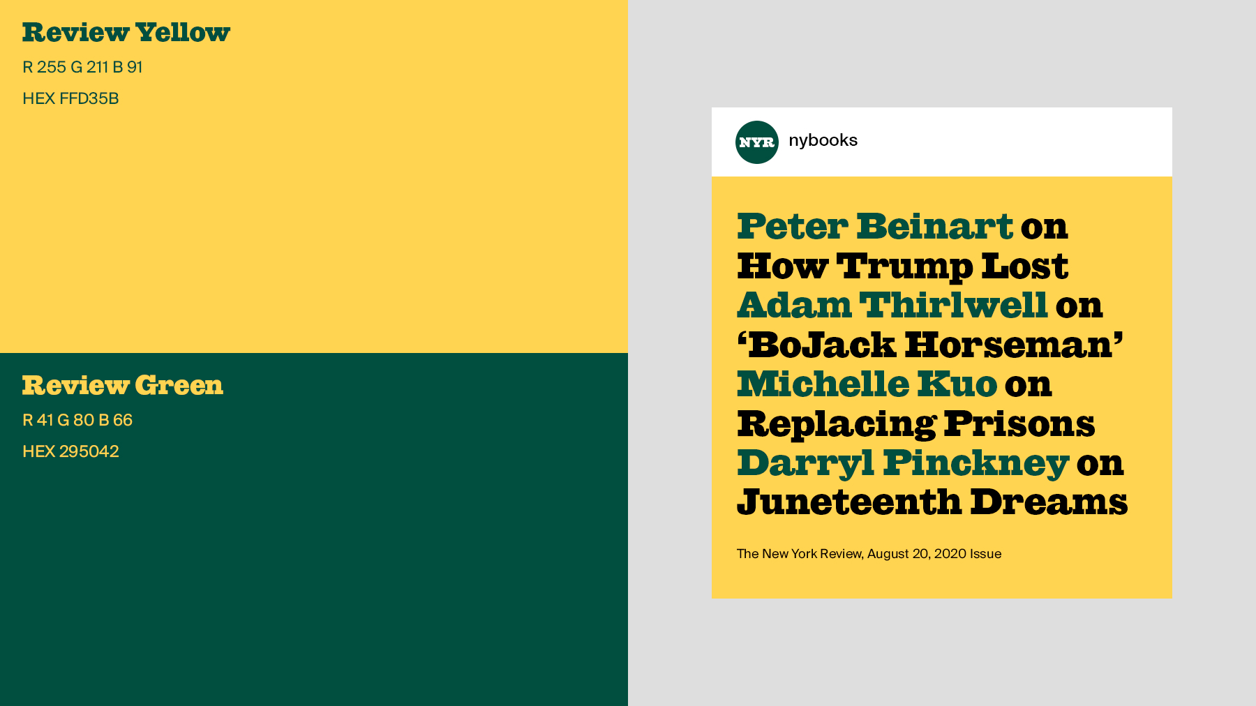
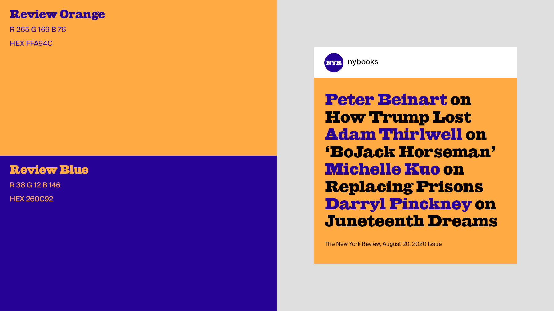
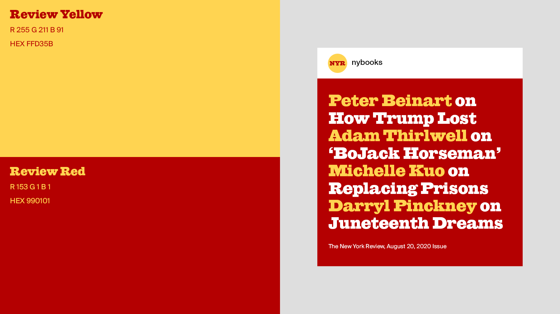
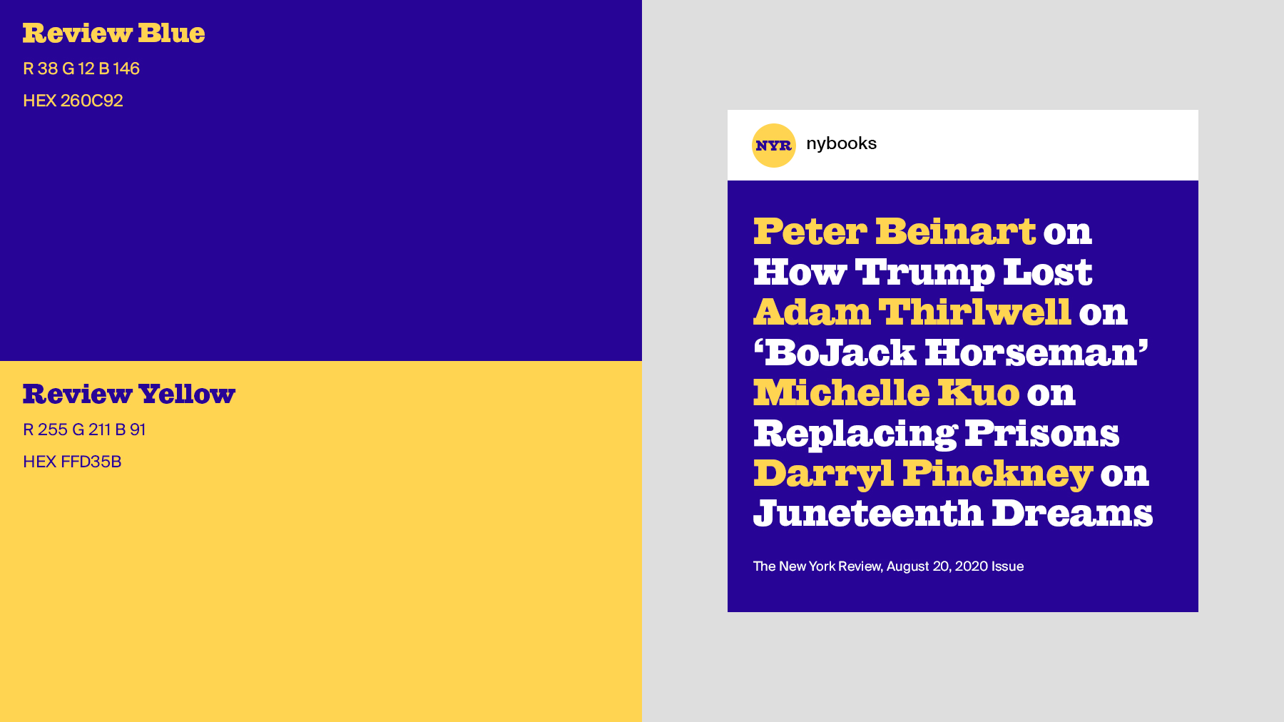
The color system is another way of bringing the heritage of the Review to the digital experience. The colors we chose came from old magazine covers, we then created color pairs that could work in different color combinations alongside illustrations and photography.
Our visual system brings the heritage of The Review to the forefront by embracing their signature font, Giza. We used it for headlines and titles. We also found a complimentary font, Ivar, for body copy.
The color system is another way of bringing the heritage of the Review to the digital experience. The colors we chose came from old magazine covers, we then created color pairs that could work in different color combinations alongside illustrations and photography.

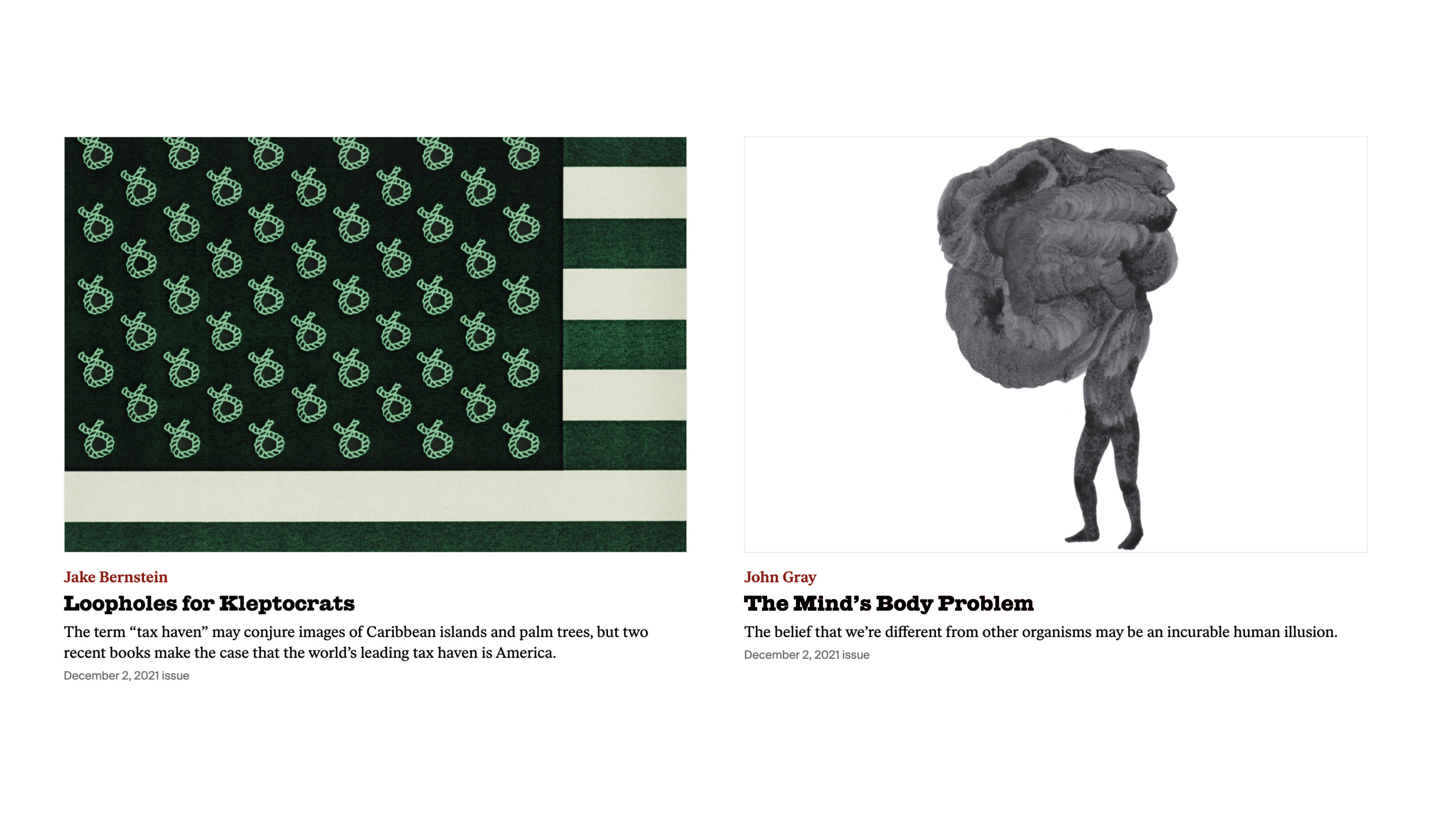
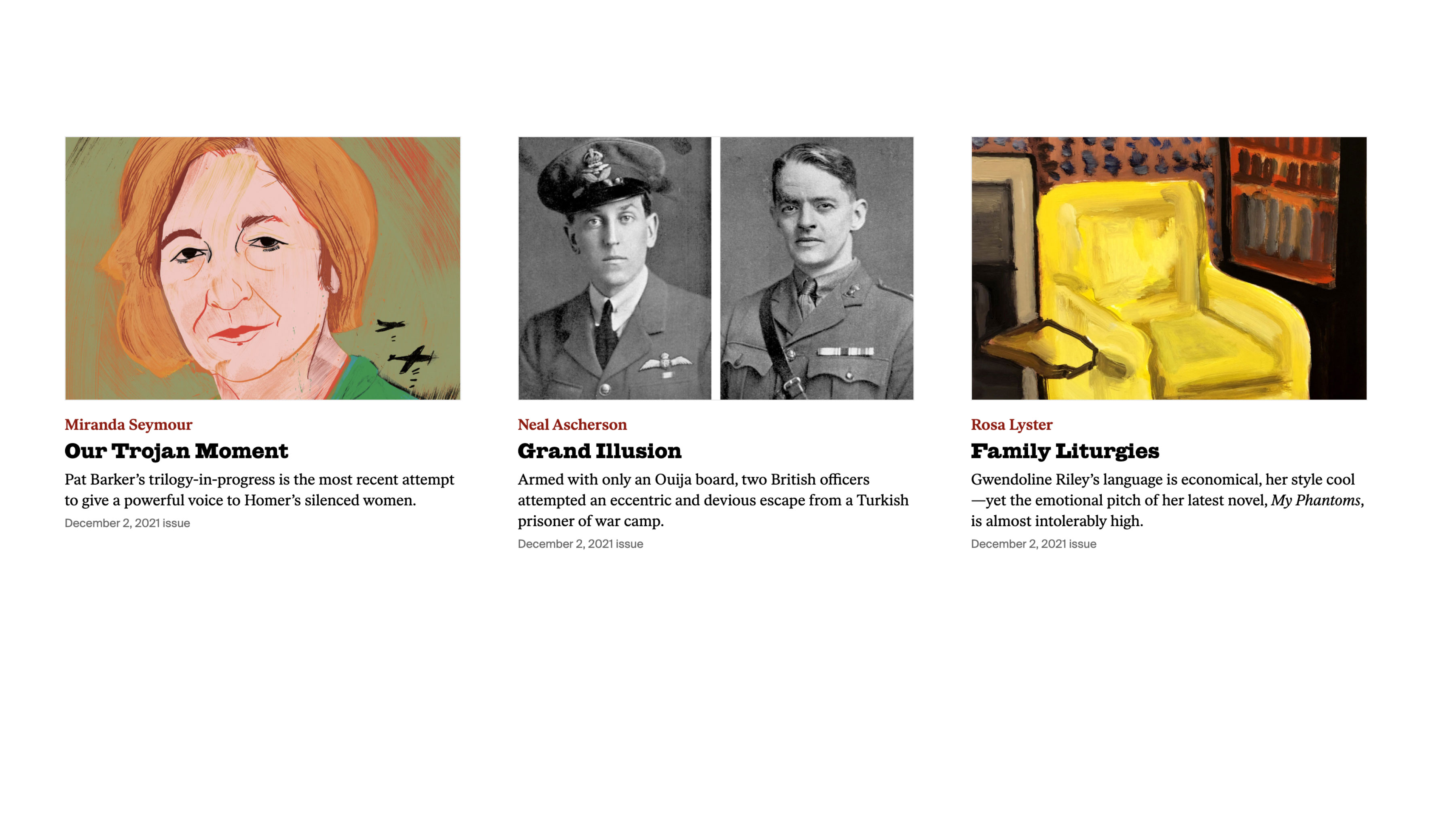
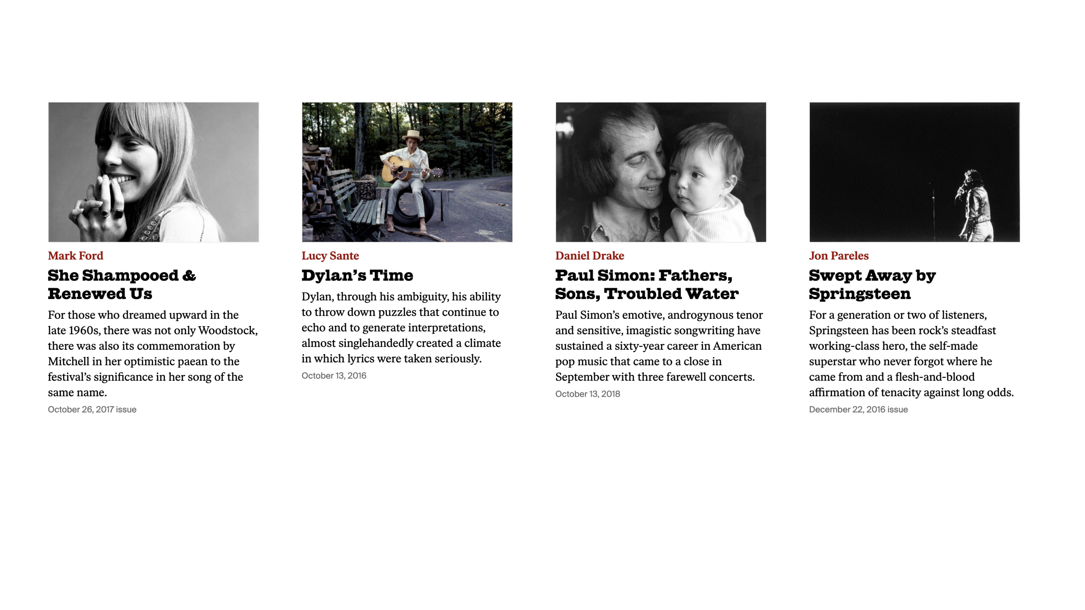
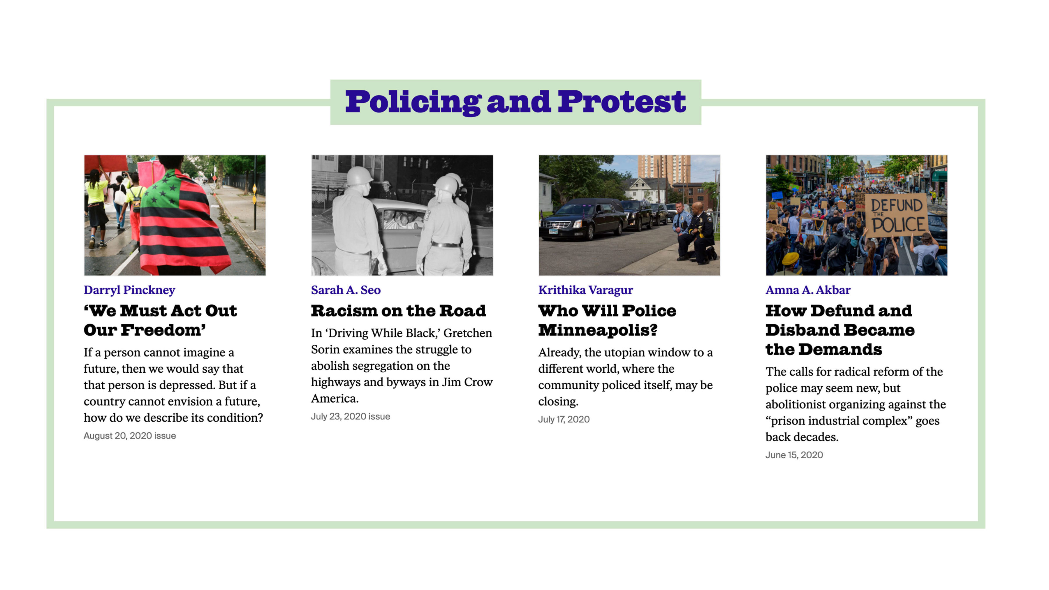
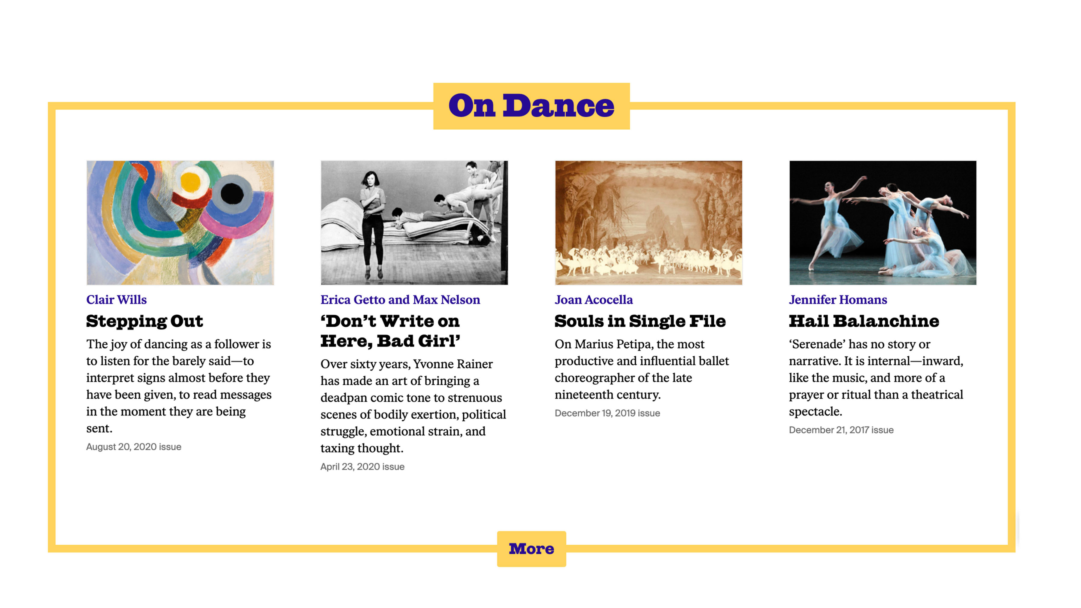
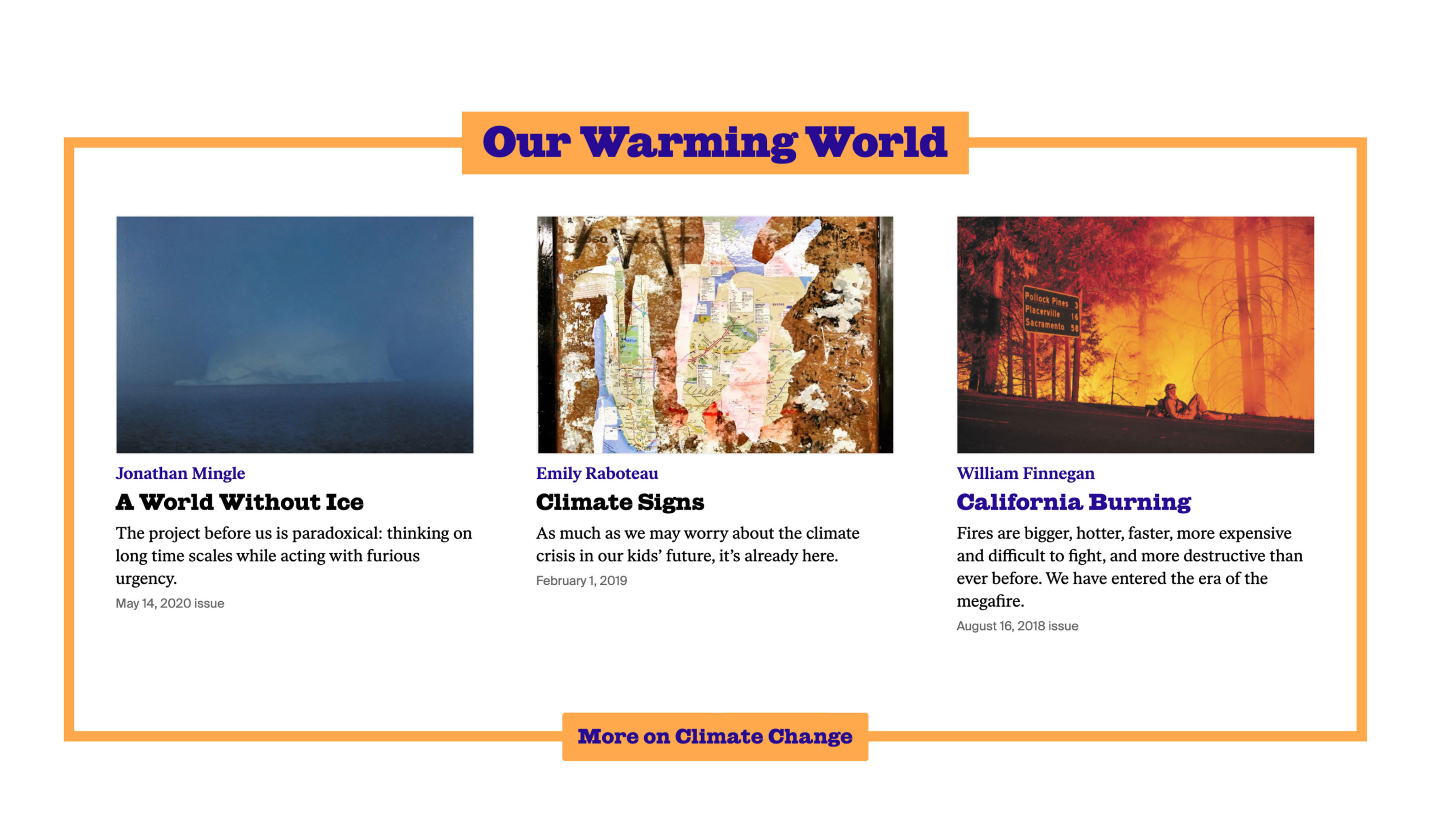
Content modules
Within the larger modular system, we developed a set of dynamic content modules that give the editorial team freedom to craft unique stories across the homepage and lander pages. These modules work in different combinations and can be grouped as content collections.
Within the larger modular system, we developed a set of dynamic content modules that give the editorial team freedom to craft unique stories across the homepage and lander pages. These modules work in different combinations and can be grouped as content collections.
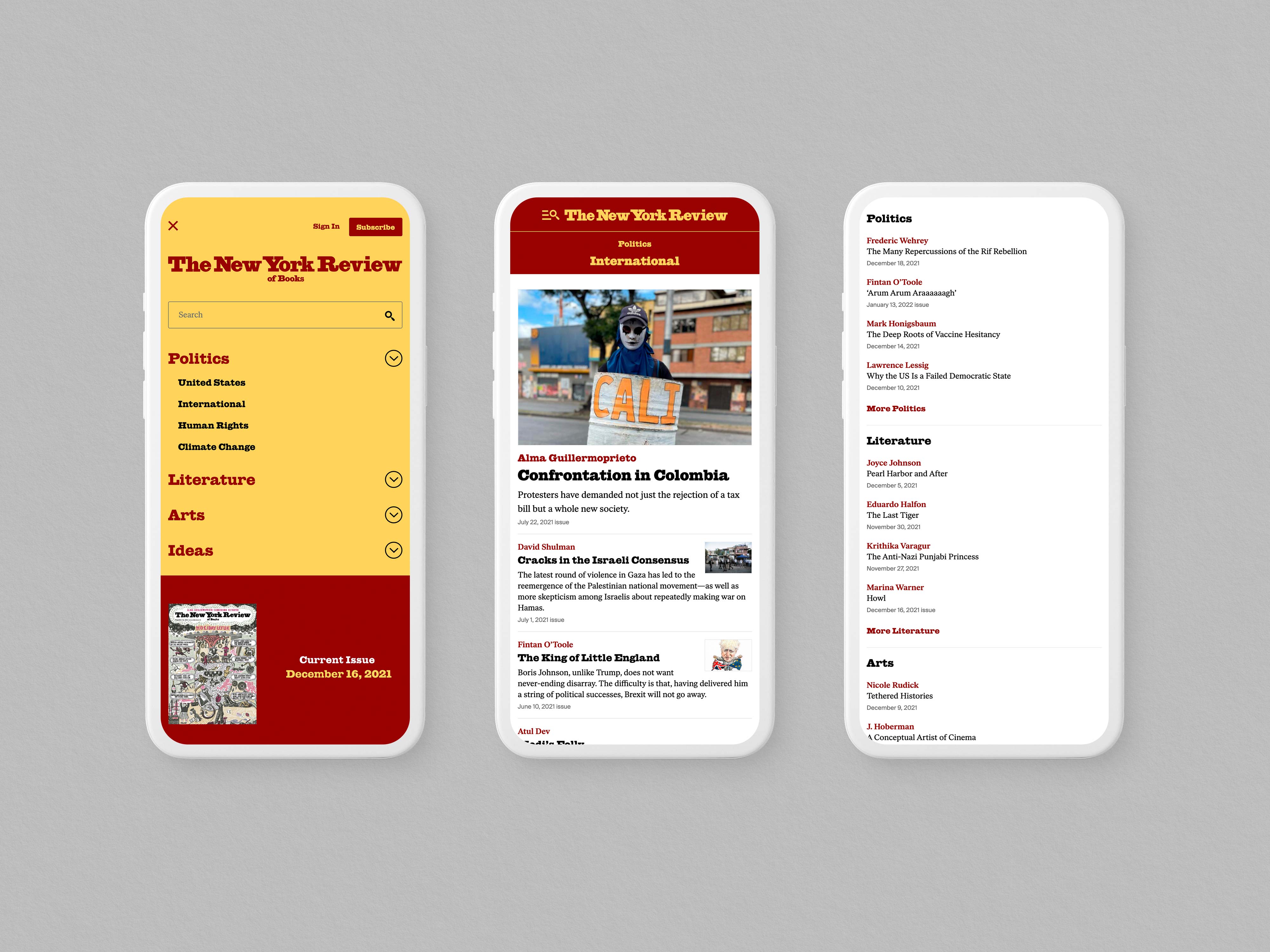
Content strategy
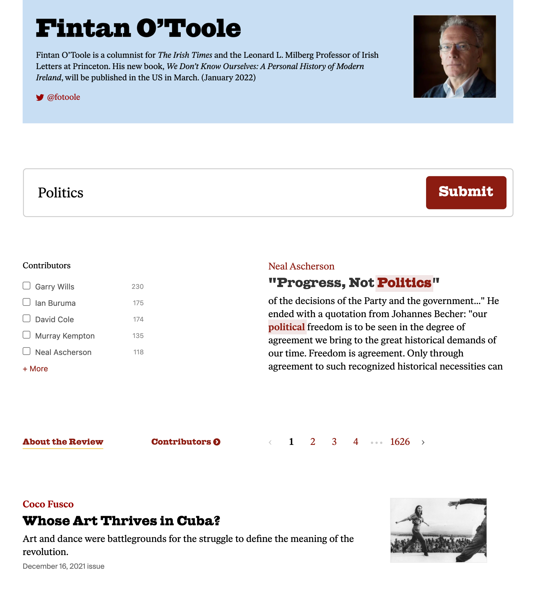
We helped the editorial team with a new content architecture, one that makes them lead with the topics they review and write about. The new structure helped streamline the main site navigation, giving the new users a better way to navigate the website.
We helped the editorial team with a new content architecture, one that makes them lead with the topics they review and write about. The new structure helped streamline the main site navigation, giving the new users a better way to navigate the website.
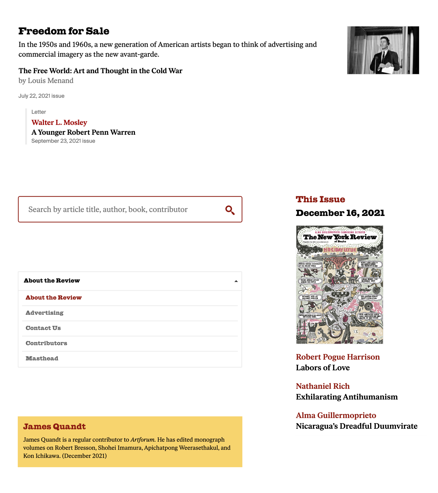
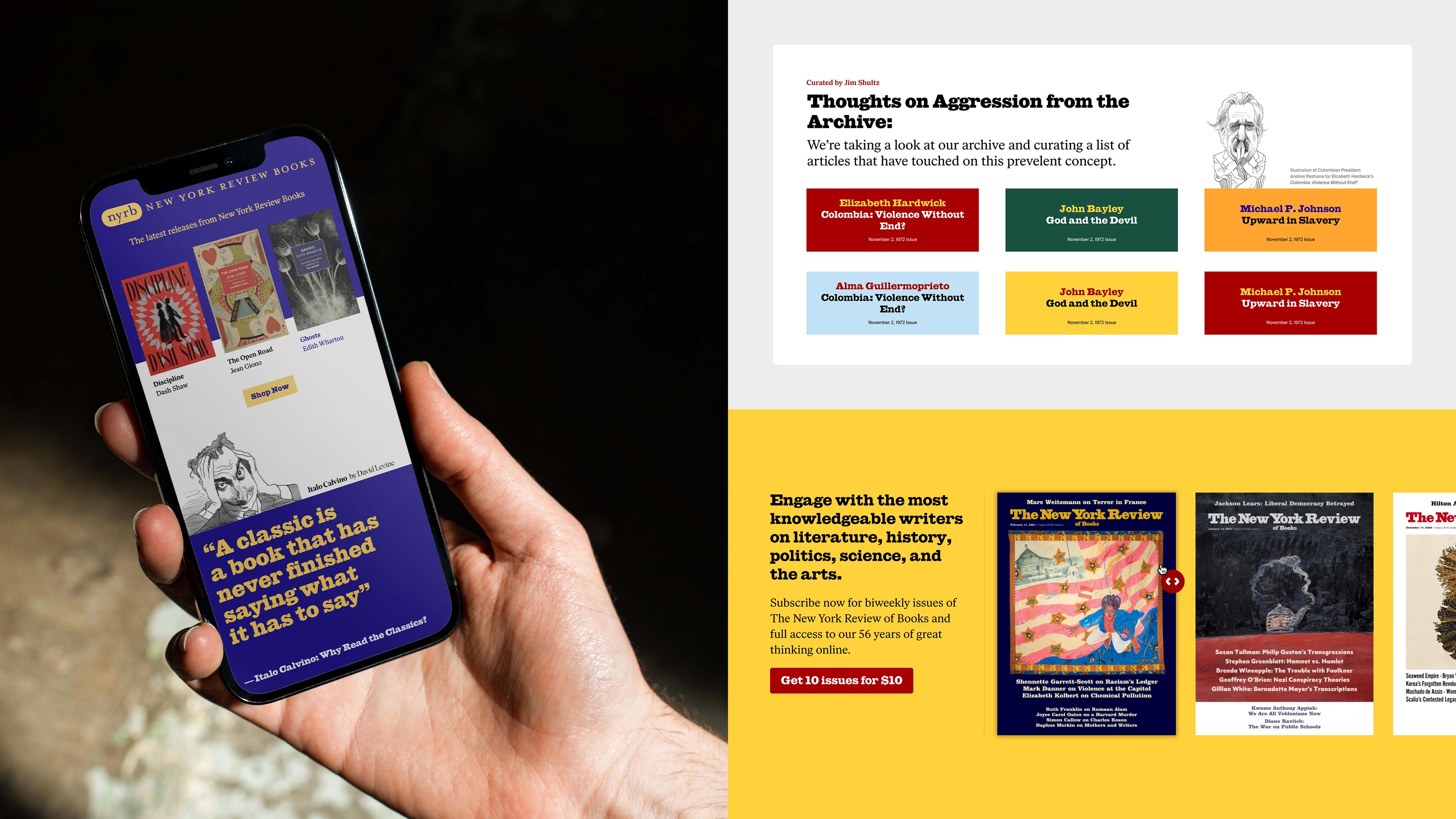
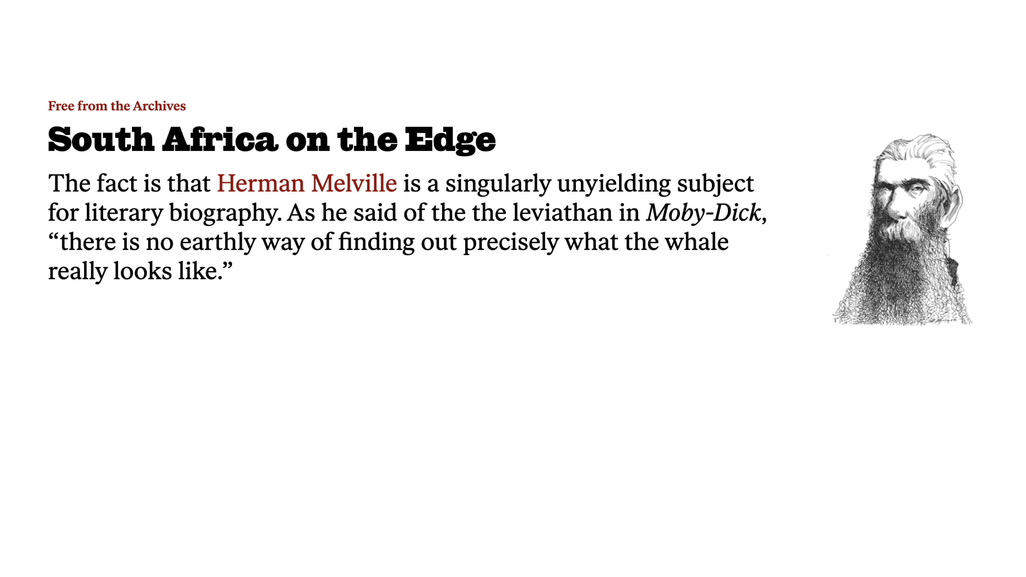
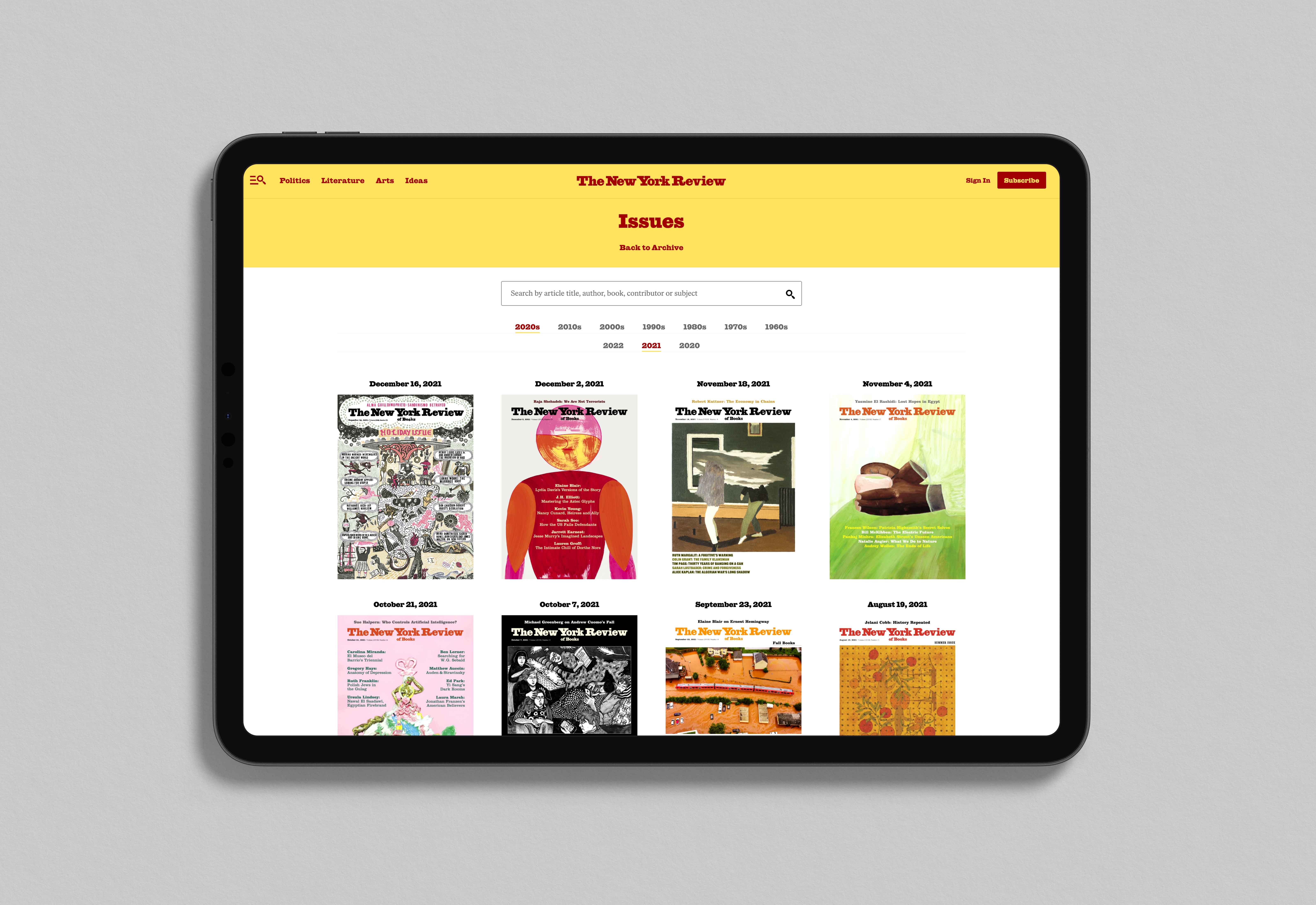
Issues & Archive
We wanted to bring old issues and archive content higher in the content hierarchy. We redesigned the issues lander to be more user-friendly and easy to search for older magazines. We also created an archive lander where editors can curate unique stories using archive content.
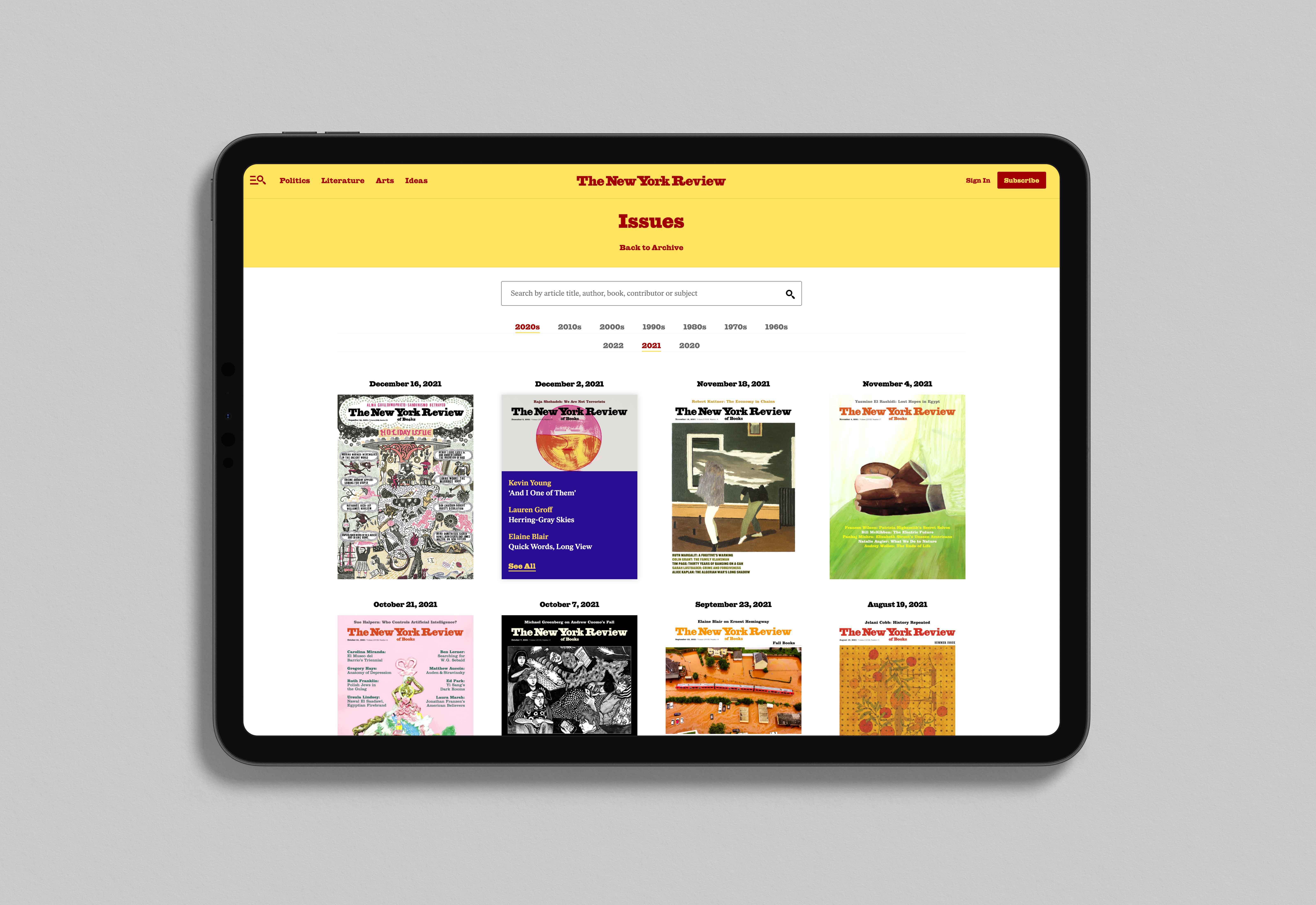
Another way we surfaced archive content was by creating an issues module on the homepage that highlights current issues and drives traffic into the issues lander.
We wanted to bring old issues and archive content higher in the content hierarchy. We redesigned the issues lander to be more user-friendly and easy to search for older magazines. We also created an archive lander where editors can curate unique stories using archive content.
Another way we surfaced archive content was by creating an issues module on the homepage that highlights current issues and drives traffic into the issues lander.
Athletics project team
- Partner: Jameson Proctor
- Project Manager: Kathryn Farwell
- Designers: Allison Connell & Jaime Patino-Calvo
- Strategists: Mila Linares & Jesse Poe
- Developers: Ross Luebe & Britton Walker
Brand, Product & Experience Design • Jaime.patinocalvo@gmail.com • 954.993.9313