Citrix Soundboard
A component of the Citrix rebrand was to develop sonic branding and make it a core component of their digital experience. One way to activate this new sonic expression was to create a soundboard for Citrix employees. Designed at Athletics
Role: UI, UX, and Interactive design
Role: UI, UX, and Interactive design
Big picture
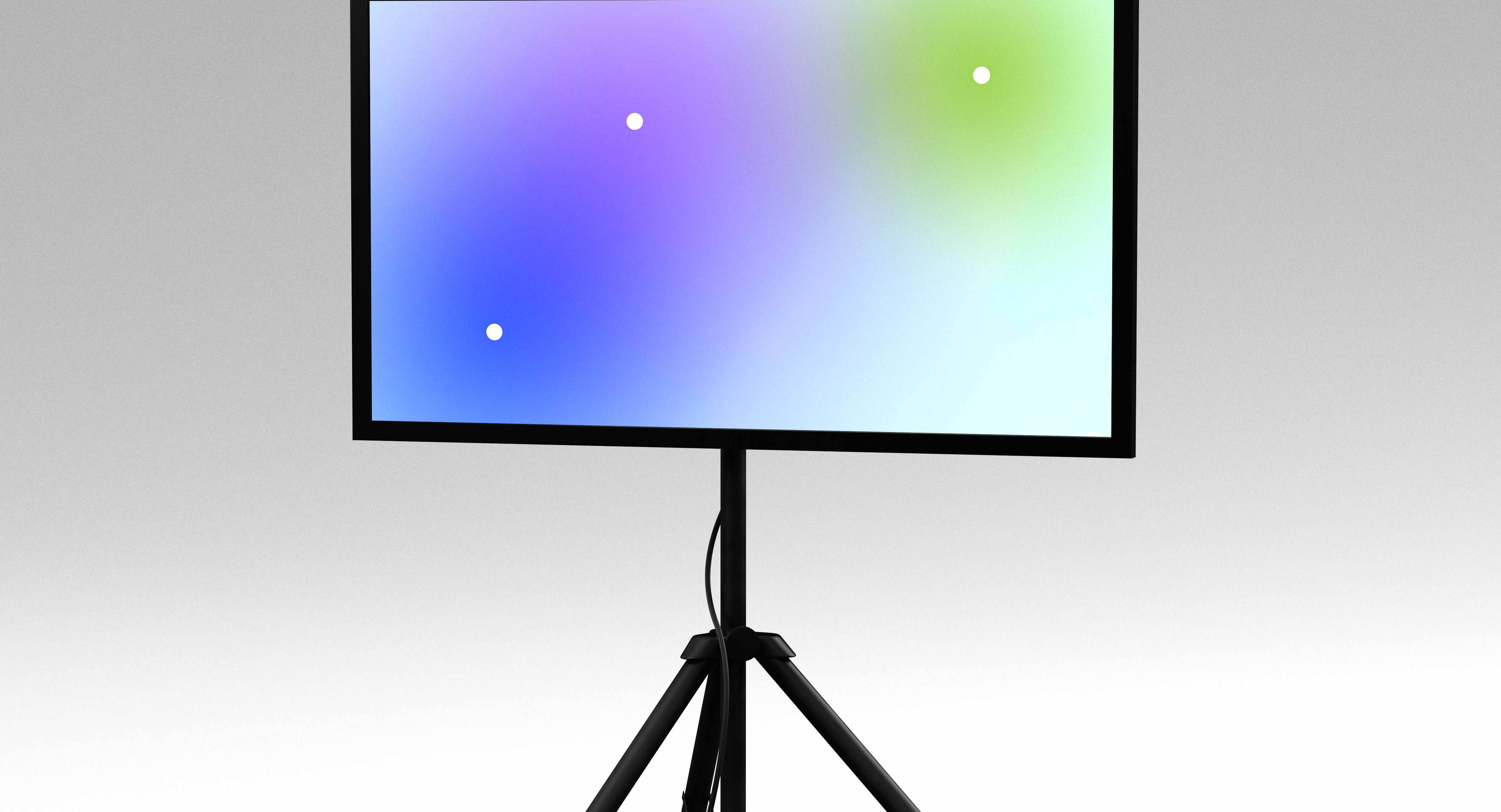
Working together with the Citrix marketing team, we envisioned a tool that employees could use internally to create unique branded sonic assets.
We ran a few workshops that helped us define the different types of users, their mental models when using the tool, and what features and functionalities would be essential for the success of this product.


UX strategy
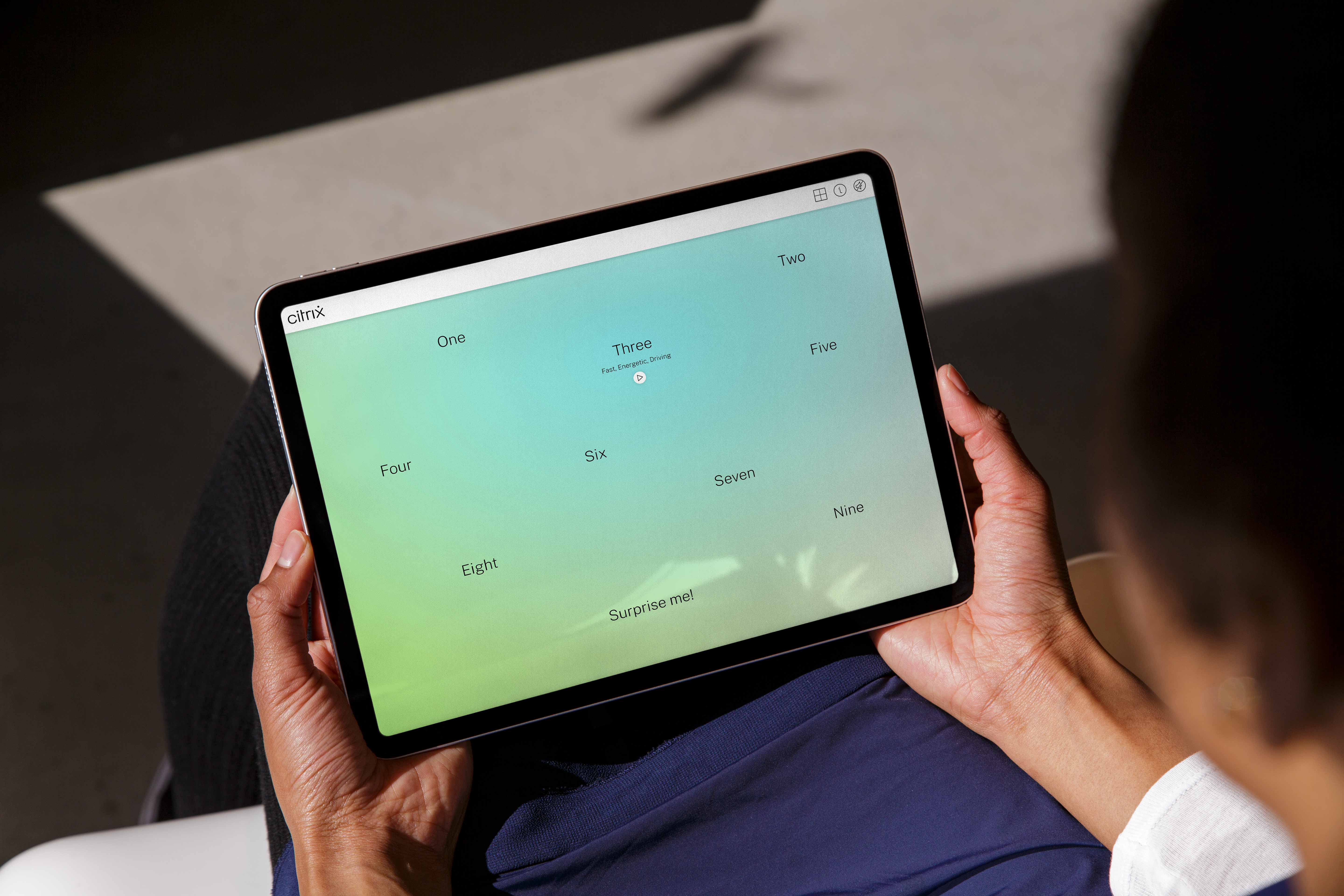
Working together with a developer and sound engineer, we began wireframing and mapping out the music creation experience. We wanted to understand how users would select a soundtrack, how they would edit, and how they could export the newly created tracks.
Working together with a developer and sound engineer, we began wireframing and mapping out the music creation experience. We wanted to understand how users would select a soundtrack, how they would edit, and how they could export the newly created tracks.

Mobile exploration
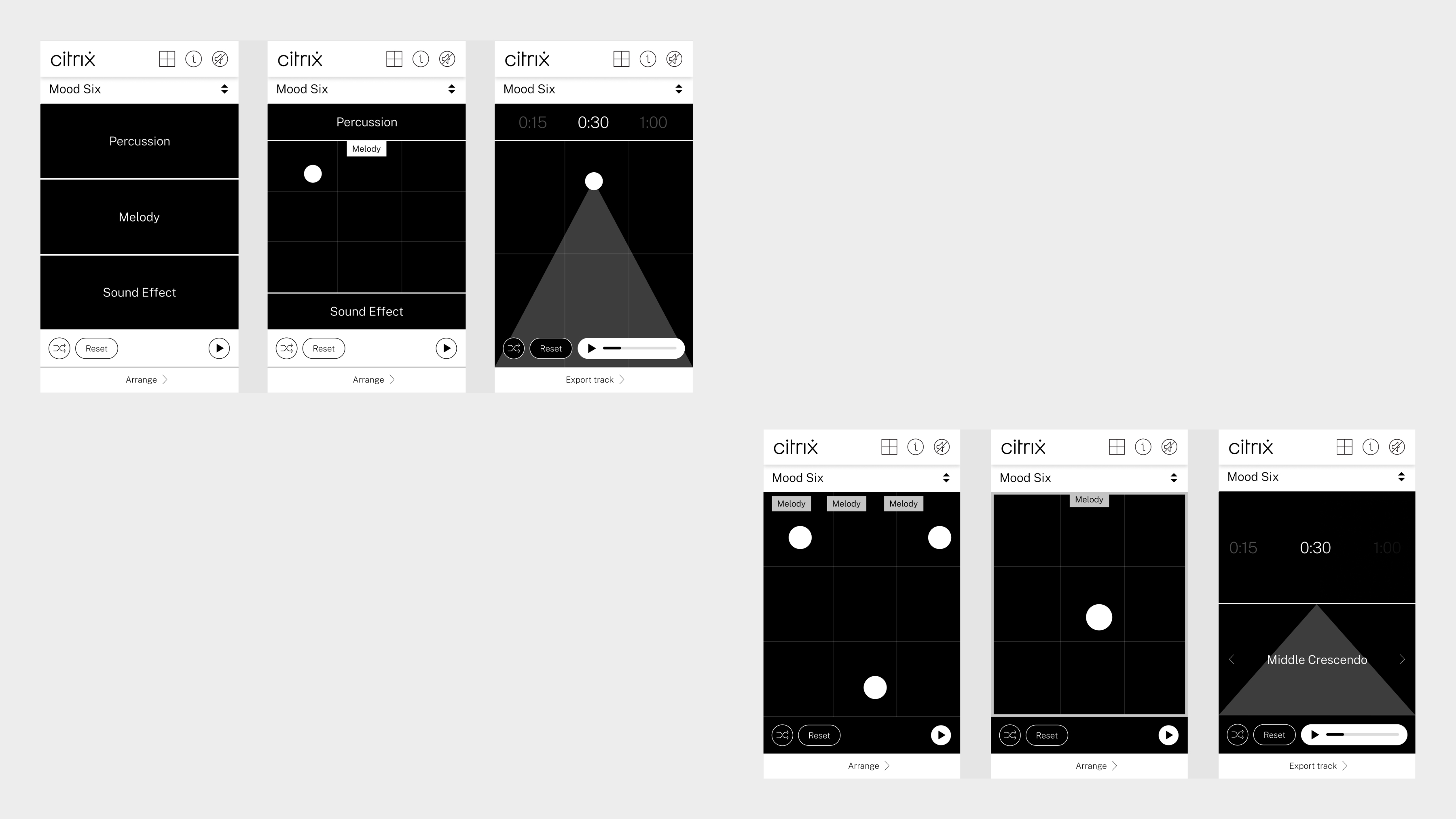
Even though the soundboard was optimized for desktop and tablet only, We still looked at a few mobile solutions. We specifically wireframed a few concepts for the sound creation screens.
Even though the soundboard was optimized for desktop and tablet only, We still looked at a few mobile solutions. We specifically wireframed a few concepts for the sound creation screens.
The system
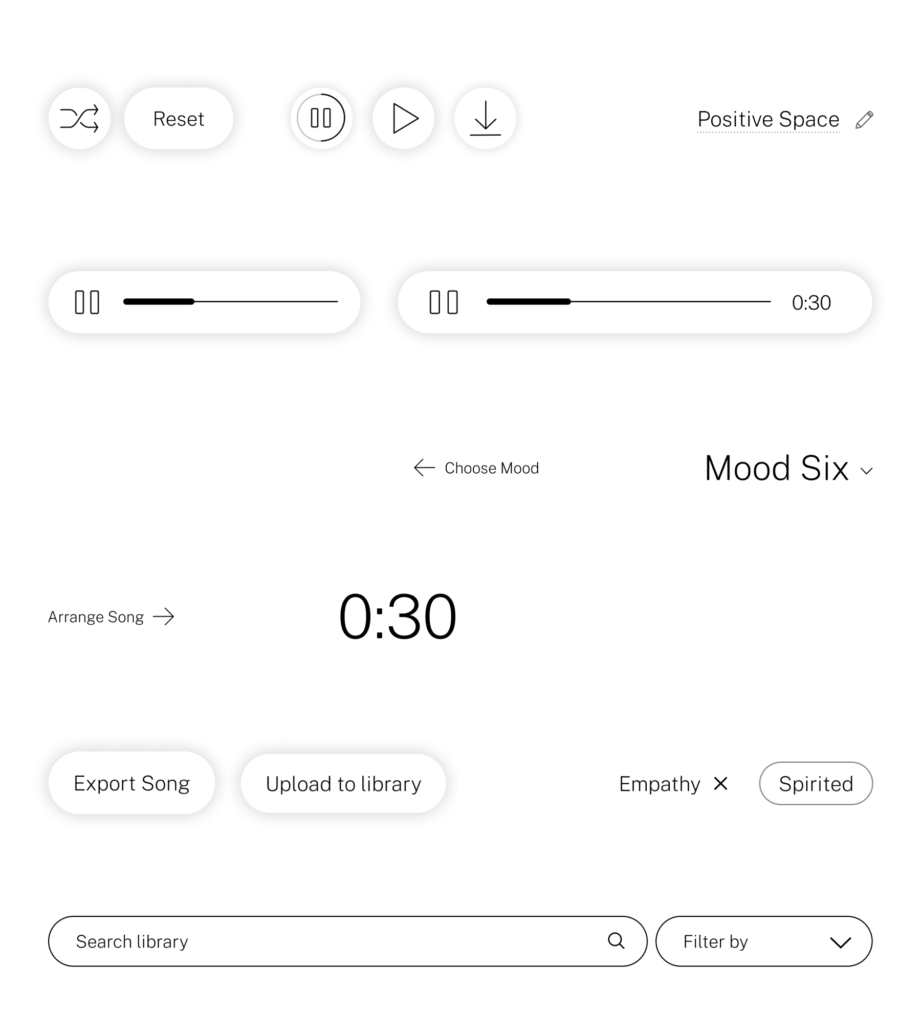
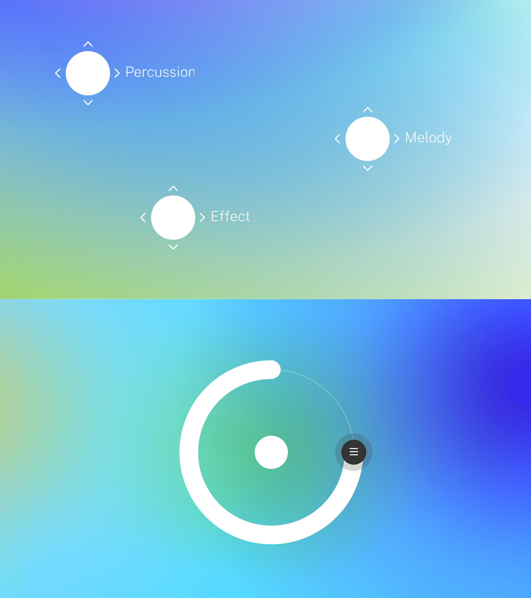
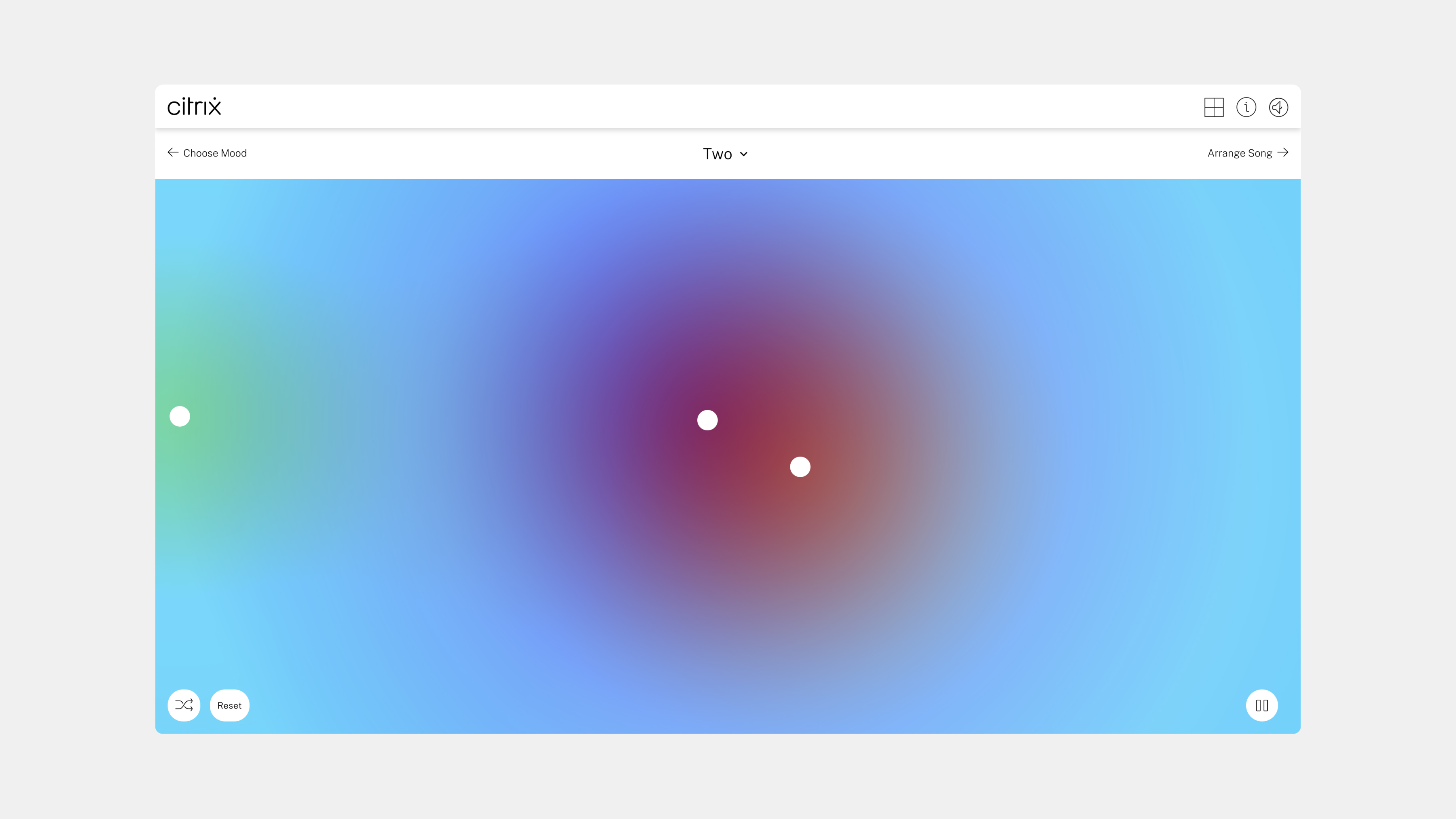
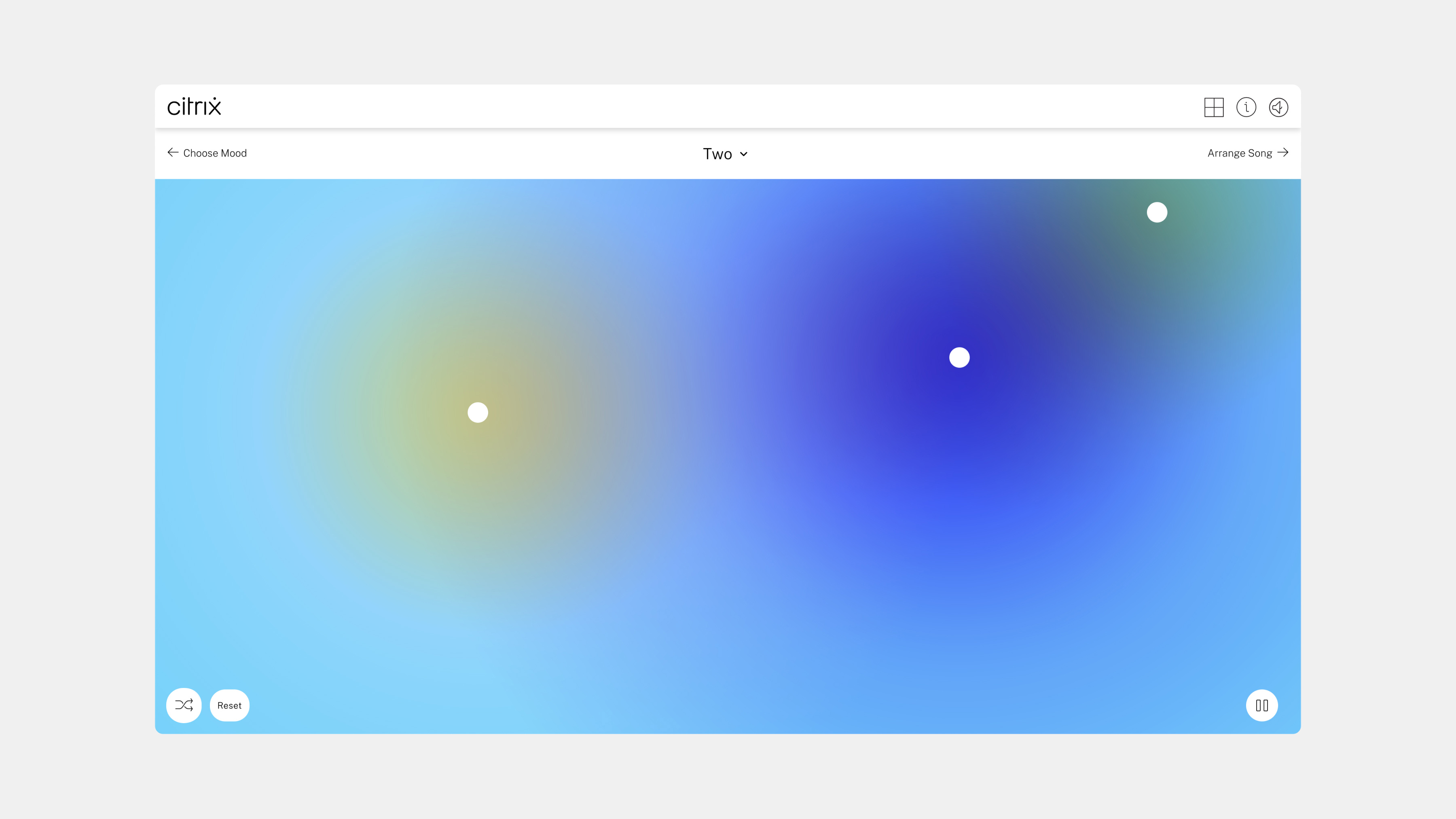
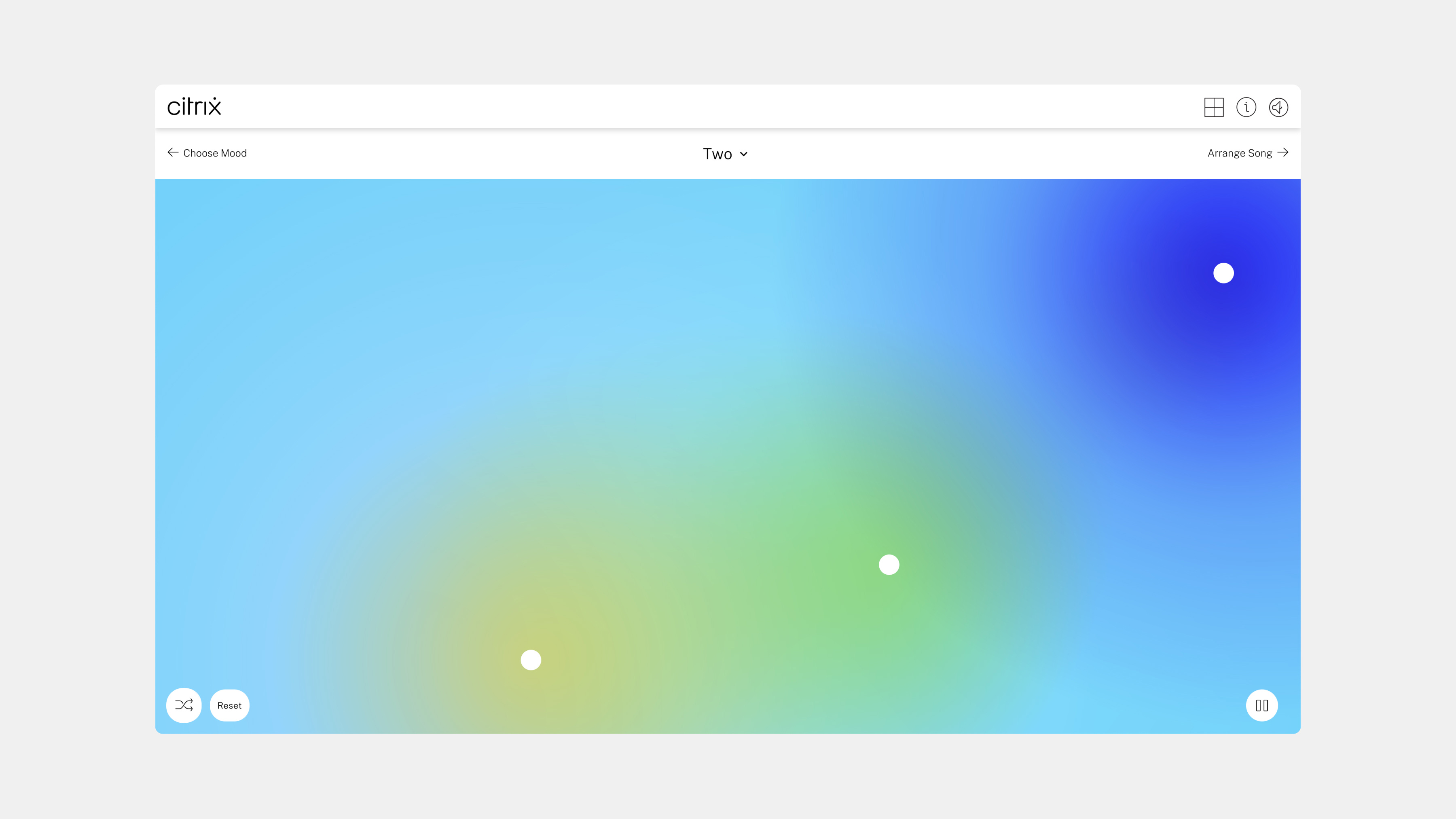
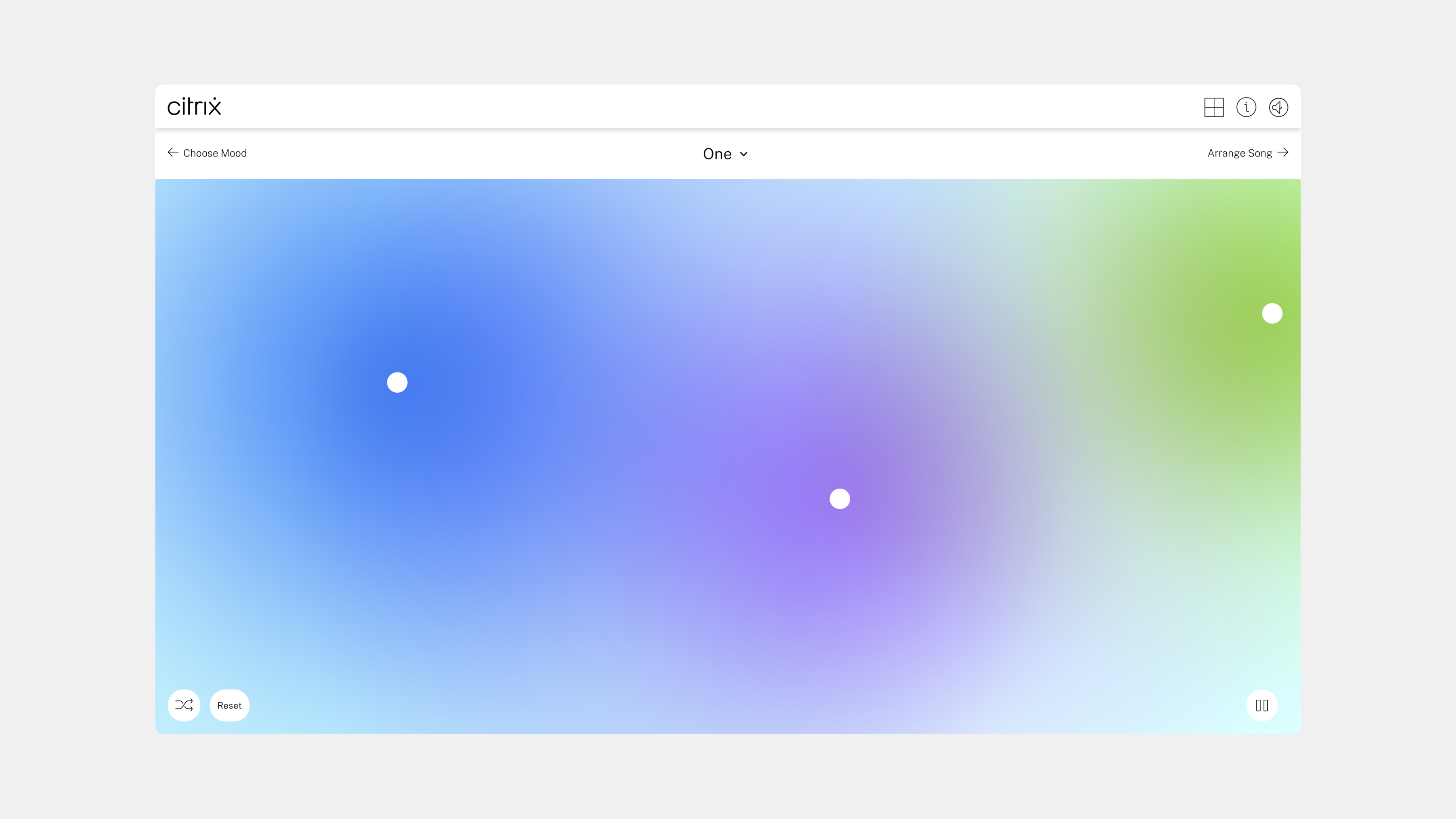
For the UI system, we went with a streamlined approach. We wanted the experience to feel open and expressive without too many controls getting in the way. In the sound creation screens, we went with a minimalist approach where the user can drag dots around and change the different sound elements of the main track. We added hold interactions for accessing volume controls within individual sound effects.
For the UI system, we went with a streamlined approach. We wanted the experience to feel open and expressive without too many controls getting in the way. In the sound creation screens, we went with a minimalist approach where the user can drag dots around and change the different sound elements of the main track. We added hold interactions for accessing volume controls within individual sound effects.
The gradients
We developed a set of ambient gradients that reacted as users dragged the dots around the screen. These gradients were using core colors from the Citrix brand system, and depending on the proximity of one circle to the other, the colors would mix, creating new hues.
We developed a set of ambient gradients that reacted as users dragged the dots around the screen. These gradients were using core colors from the Citrix brand system, and depending on the proximity of one circle to the other, the colors would mix, creating new hues.
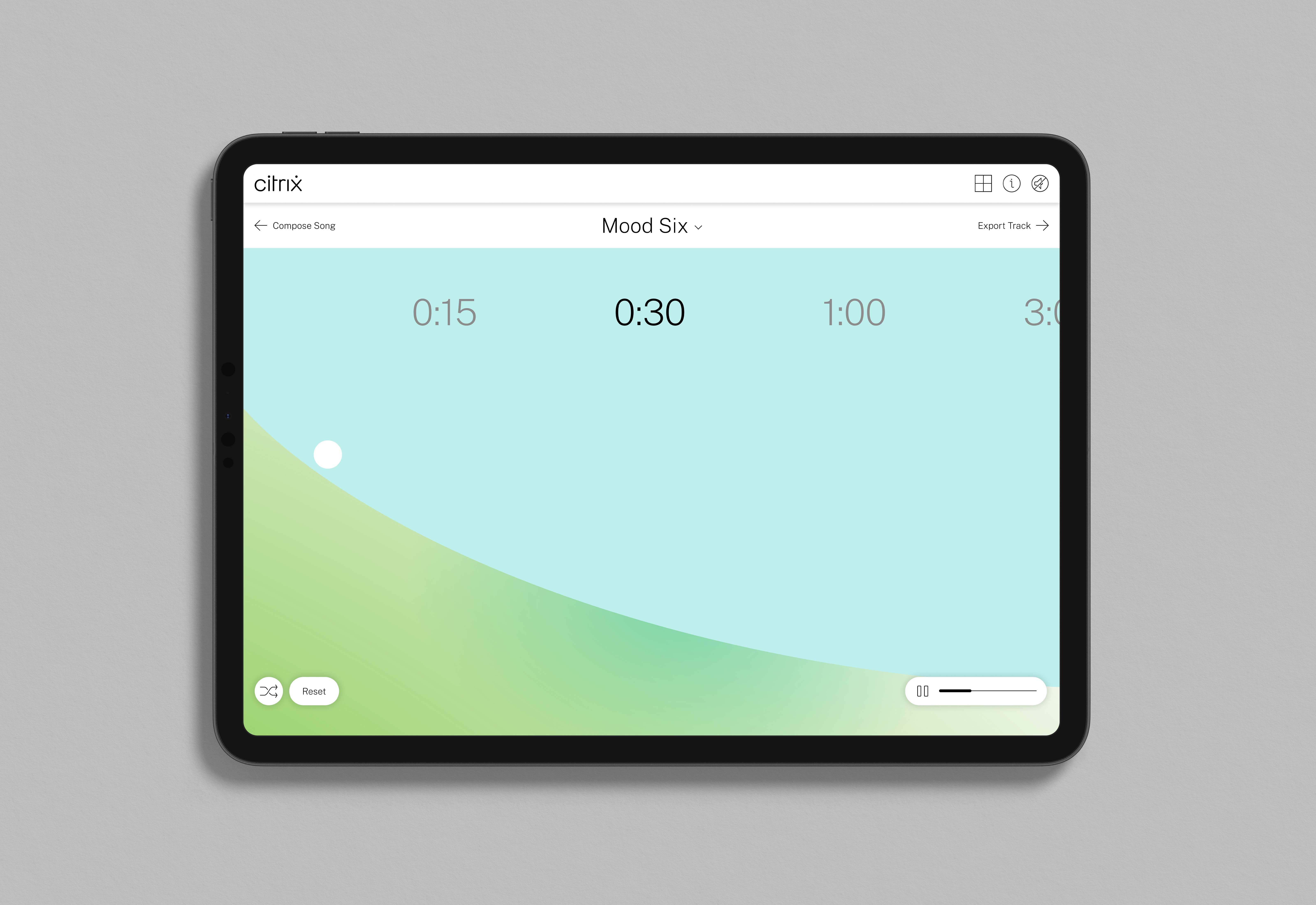
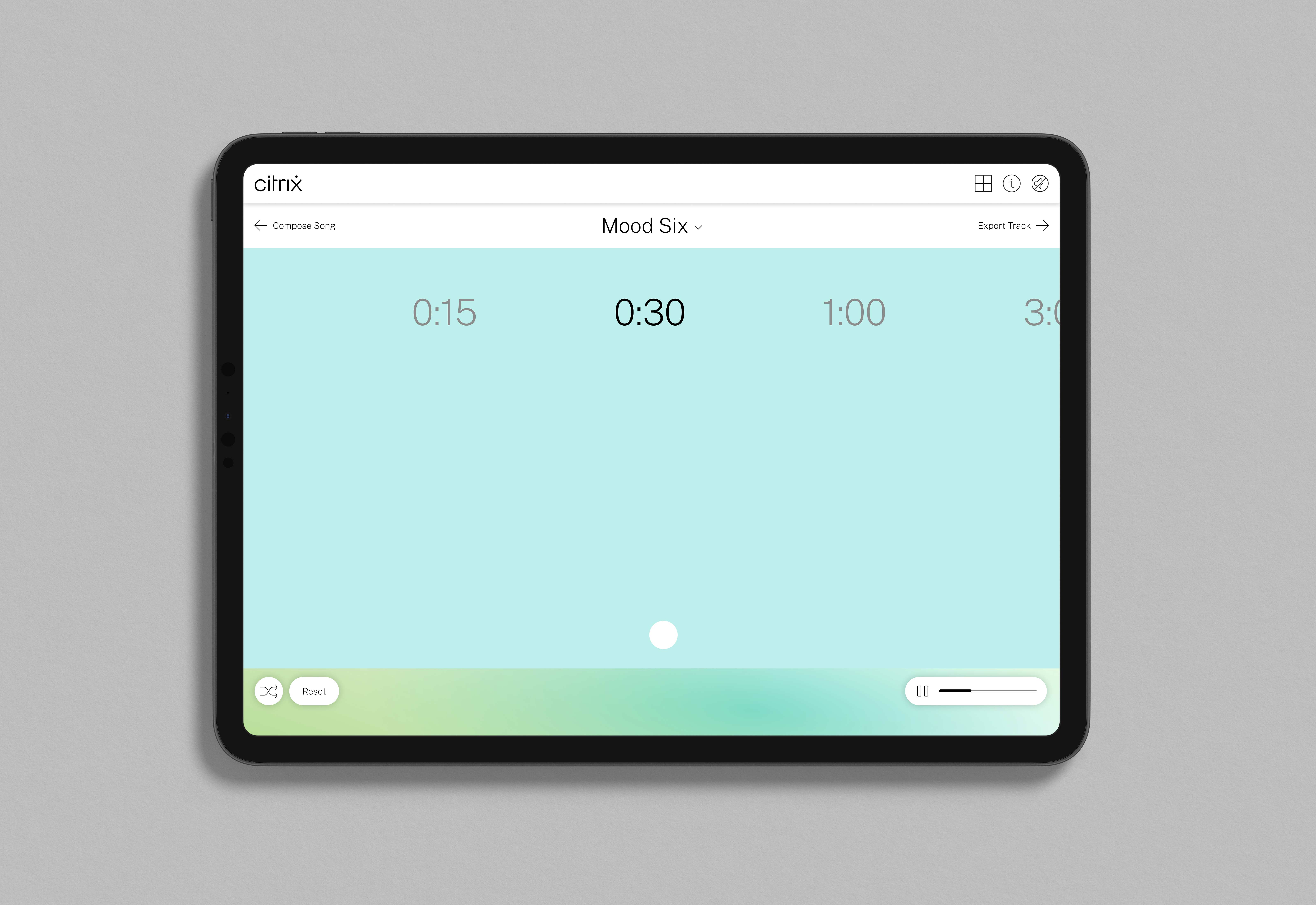

Users can set time and drag the dot to add a sound curve to compose how the track starts and ends
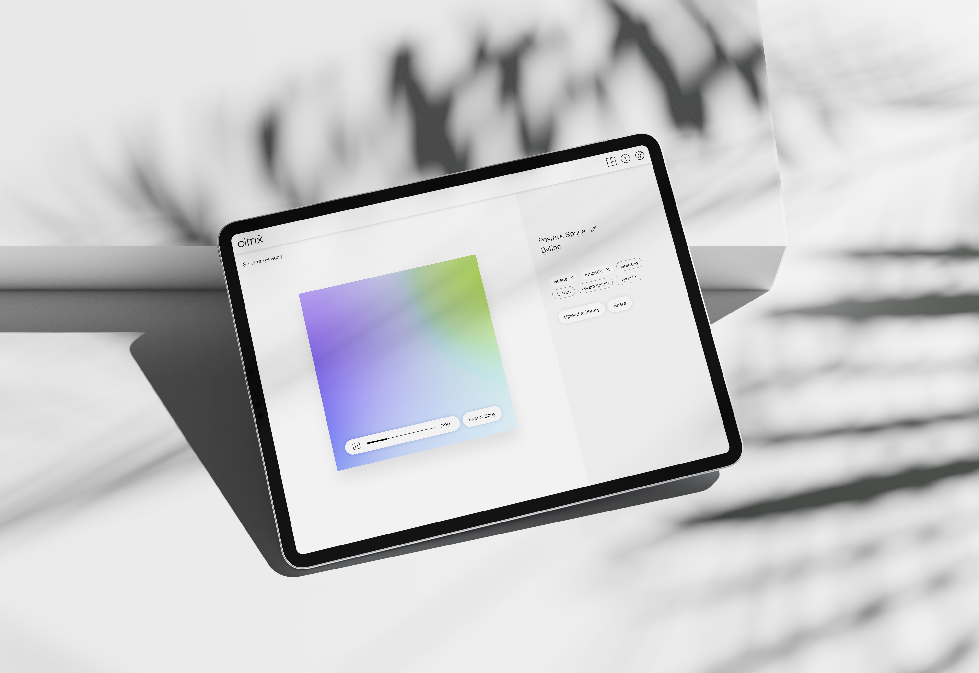
Once the track is arranged and composed, users can export and save it to the library
Personalization
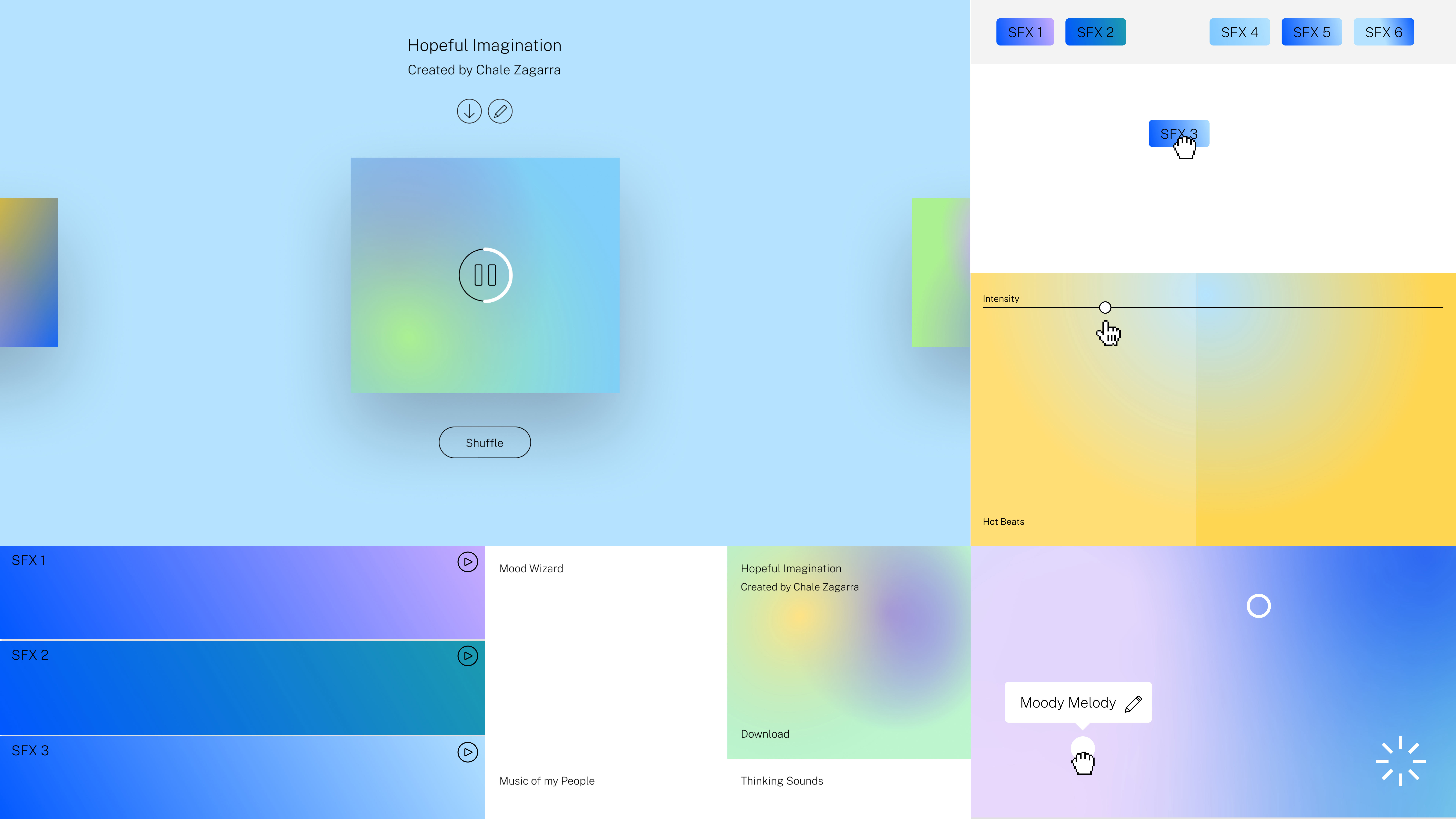
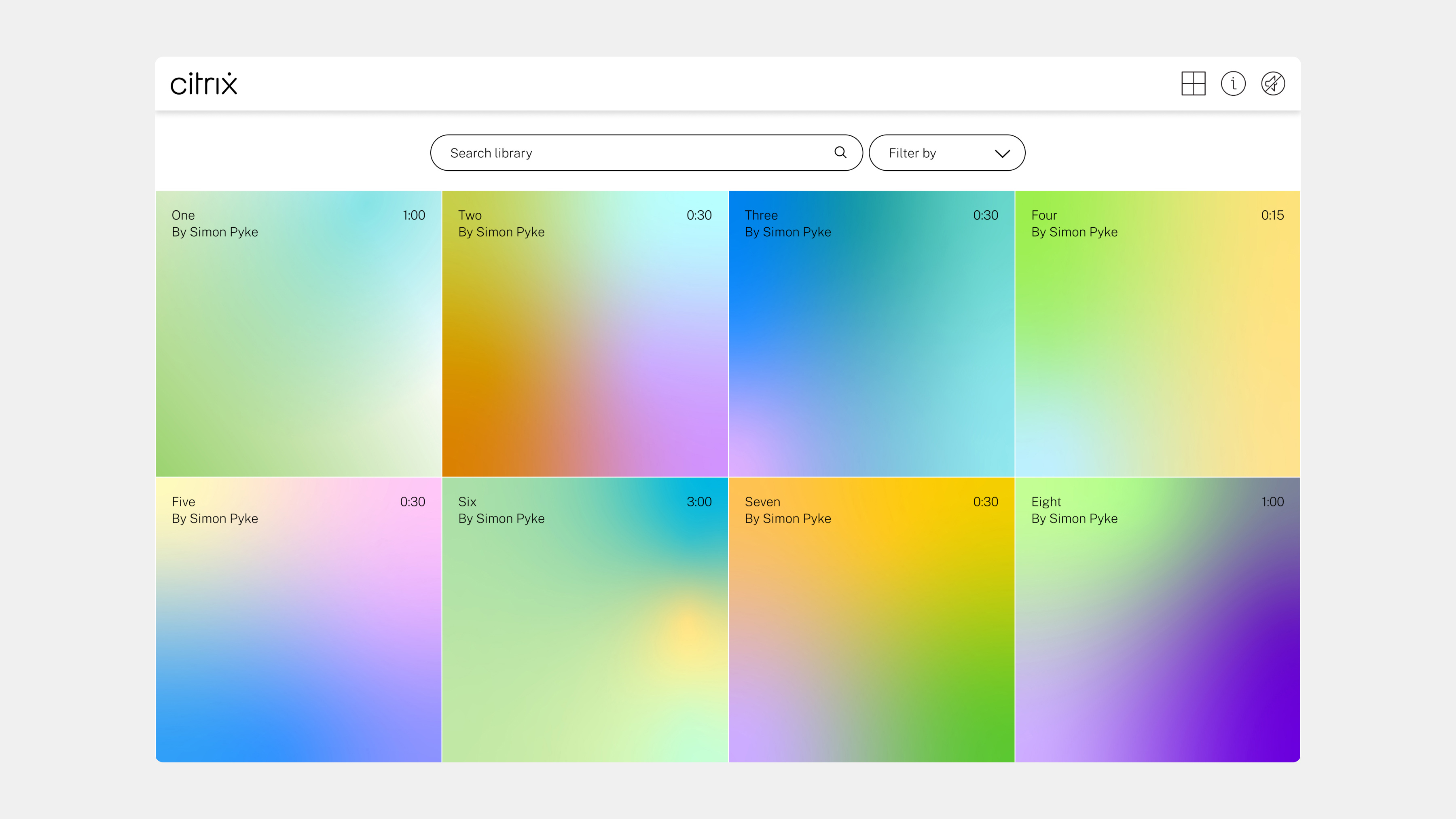
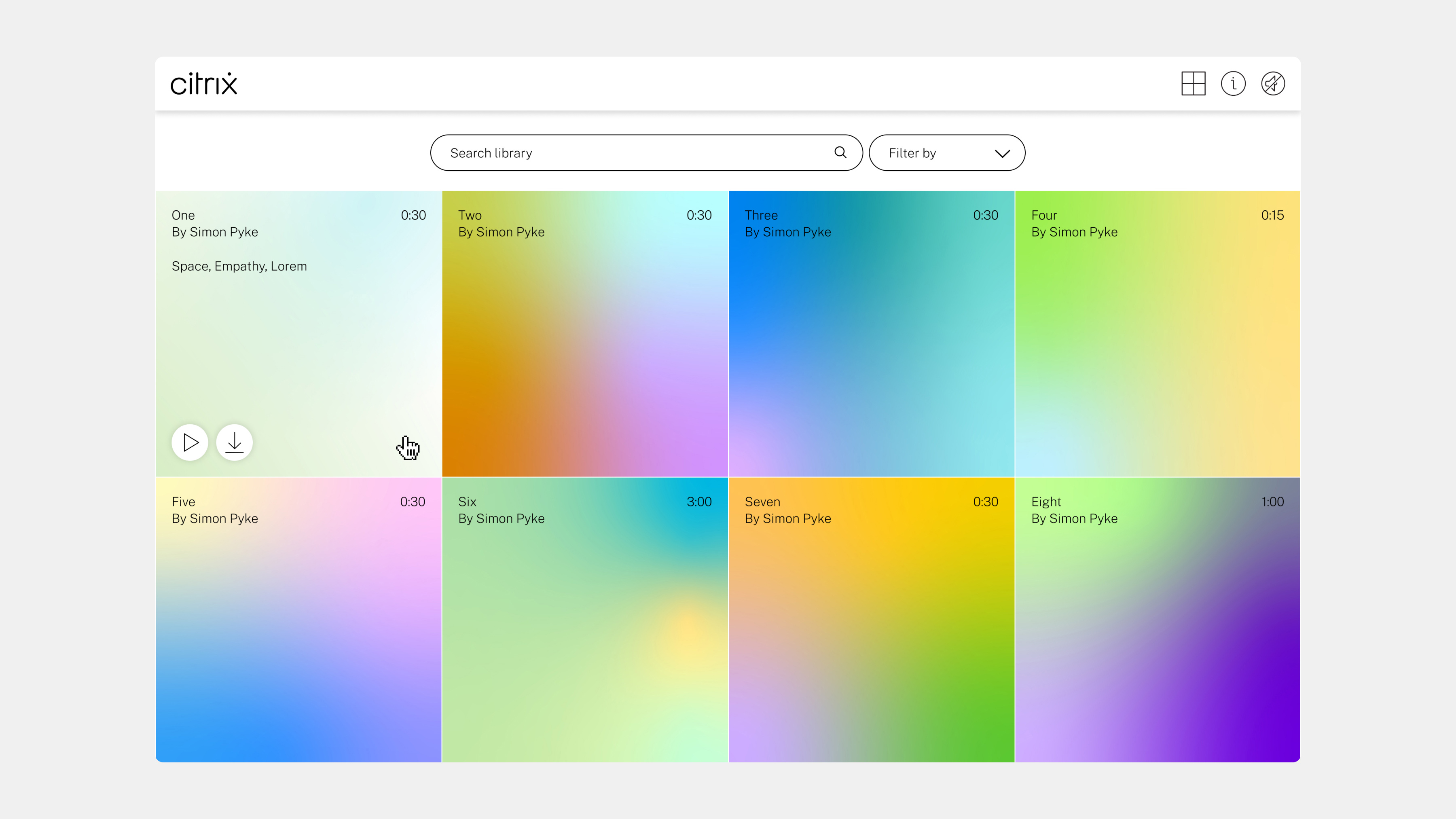
A core idea of this product was to give users a way to add their newly created sounds to a sound library. These soundtracks can then be accessible to the larger community of Citrix employees. One fun feature of the library was the unique gradient album covers that each piece would get, making them feel unique and special, like collectibles.
A core idea of this product was to give users a way to add their newly created sounds to a sound library. These soundtracks can then be accessible to the larger community of Citrix employees. One fun feature of the library was the unique gradient album covers that each piece would get, making them feel unique and special, like collectibles.
Athletics project team
- Partners: Jameson Proctor, Malcolm Buick
- Project Manager: Allie Stenclik
- Designers: Allison Connell & Jaime Patino-Calvo
- Developer: Richard Lehmann
- Sound engineer: Simon Pike
Brand, Product & Experience Design • Jaime.patinocalvo@gmail.com • 954.993.9313